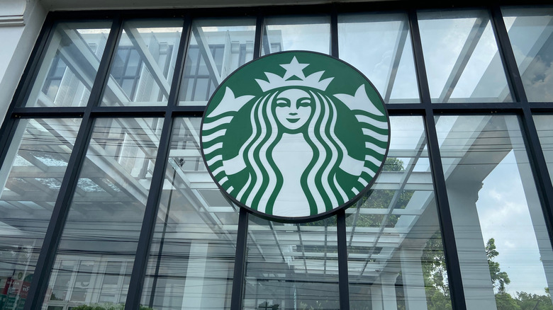
The Real Story Behind The Starbucks Logo
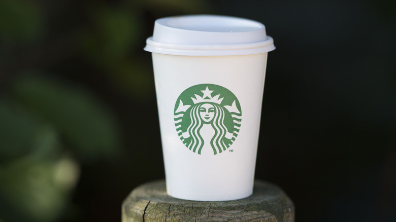
The Starbucks siren logo, appearing on coffee cups all over the known world (and even in the occasional fictional world like Westeros, as witnessed in the notorious "Game of Thrones gaffe"), is meant, according to the company website, to "evok[e] coffee's allure and its seafaring tradition." In fact, the whole nautical motif is kind of a thing, since Starbucks did, in fact, adopt its name from a character in the Great American Whale Novel, "Moby Dick."
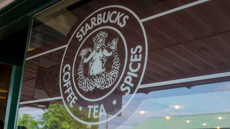
On a more basic level, the mermaid embodies the basic advertising principle that pretty girls make people want to buy stuff. Or, perhaps according to the earlier, boobier version of the Starbucks logo, "sex sells." Of course, the company long ago ditched the topless version for a more family-friendly mascot, a logo evolution that was bound to go over better with the sippy cups and strollers crowd as well as in some of the more conservative countries where it expanded as it grew towards global domination.
The Starbucks logo features a siren, not a mermaid
So what does Starbucks have to say about its logo? Creative director Steve Murray says the siren is the face of the brand (quite literally), and although he admits "She is not a real person" (so not based on the founder's wife or anything), he adds that "we kind of think of her as one." Starbucks is also quick to point out that the mascot is not a mermaid since mermaids have just one tail whereas sirens, they say, have two.
As for why the company chose this mythological maiden, it says not only does the siren tie in with the nautical motif of the chain's "Moby Dick"-inspired name, it also tracks with the fact that Starbucks' hometown Seattle lies in fairly close proximity to the Pacific ocean. What's more, the coffee it serves is admittedly not a local product, but instead must undertake a long ocean voyage via container ship in order to arrive at their roasteries. One wonders if Starbucks' founders were aware that the sirens of Greek mythology were notorious for causing shipwrecks...
Superstition aside, the Starbucks siren has proven to be anything but ill-omened for the company, as she's been with the company from their startup days all the way to its current incarnation as a multi-zillion dollar enterprise.
The logo is asymmetrical on purpose
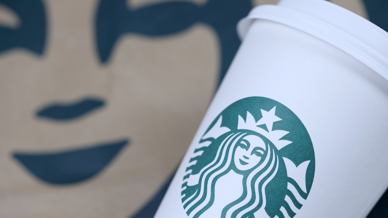
There's one interesting thing about the Starbucks logo that isn't immediately apparent but is very much intentional: The siren's face is actually somewhat asymmetrical and has been for over a decade. As to why the brand introduced a deliberate flaw into this once-perfect siren, Fast Company says it's because the pre-2011 version of the logo was actually kind of creepy.
While numerous studies have shown that symmetry is one of the main standards by which we define attractiveness, it seems there can be too much of a good thing. No real human is perfectly symmetrical, at least without the aid of highly-skilled plastic surgeons, and perhaps on some subconscious level, we associate absolute symmetry with artificiality. With this in mind, Starbucks' design team retooled the siren just a teensy bit by adding a shadow alongside her nose that breaks up some of that facial symmetry. This hint of lopsidedness made the siren more human-looking and thus, paradoxically, all the prettier for her imperfection.
The not-so-controversial controversy behind the logo
Surprisingly, even the G-rated face-only Starbucks siren has been controversial in certain circles, those being that of a) conspiracy theorists and b) the overly pedantic. The former group has seen her as a symbol of the Illuminati (honestly, what isn't seen as an Illuminati symbol?) or of a Zionist plot. It's the latter circle, though, that really likes to pick those nits and dig up the, well, not dirt, since there's nothing particularly shameful attached to the findings. Instead, these people are merely stirring the dust with scholarly criticisms.
While Starbucks says its original logo was "derived from a twin-tailed siren in an old sixteenth-century Norse woodcut," the company seems to have misspoken. The term "Norse" actually refers to Viking-era Scandinavia, so a more proper term would have been "Nordic." More shockingly, it turns out that the original woodcut may have been German, while Atlas Obscura located similar images in a Byzantine mosaic and a 12th-century Italian cathedral.
The closest thing to a scandal, however, may be the identity of the twin-tailed siren: She could be a character called Melusine, who's actually more of an inland spring-maid than a sea siren. But then, Seattle is located between Puget Sound and Lake Washington, so perhaps a siren who's also a freshwater nymph is the perfect symbol for that city's gift to the world's coffee drinkers. At any rate, the siren's cute, and the logo's not going anywhere. So just calm down and chill out with a flat white already.
Why Starbucks' name no longer appears in its logo
Starbucks these days seems well on the way to world domination and in fact, we wouldn't be at all surprised to see it open its first interplanetary location within the next few years. Still, the company has hit a few bumps in the road since its humble beginnings. One such bump occurred in the late aughties when McCafe started drawing away customers attracted by its lower-priced offerings. How, then, did Starbucks regain its market dominance? Well, for one thing, it introduced a couple of features that practically define the brand today. One of these is a robust rewards program that makes it easy for even casual patrons to earn free stuff, while the other is allowing people to customize their drink orders. (This latter change, however, is one many baristas may have come to resent as customizable Starbucks drinks birthed the ever-changing "secret menu" nightmare.)
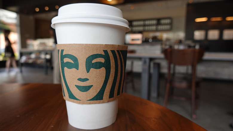
In order to symbolize the company's new direction, Starbucks adopted yet another new logo in 2011. Not only did this feature the new, nose-shadow mermaid, but even more noticeably, it dropped the Starbucks name. The reason for this is that the company felt it was now so recognizable that it didn't need to reference its name, thus one-upping single-name celebs who feel they can dispense with a last name. Certain other companies like Apple and Nike have also gone name-free with successful results, and apparently, Starbucks felt the time was right to position itself as being equally iconic.
The siren is also no longer constrained by a circle
Adding a little calculated asymmetry to the siren's face and dropping the Starbucks name weren't the only changes going on in the 2011 logo reboot. The siren also underwent a color change as well – in her very first incarnation (the bare boobies one) she was brown, while in the next two, she was black. In 2011, however, she turned green. Perhaps even more symbolic, though, was that she was no longer enclosed in a circle outline.
Okay, the siren logo is still round. So technically she's still encircled, but the circle itself no longer has an outline. What is the meaning behind this? It's possible that the designers just felt that it looked nice, but Harvard Business School marketing professor John Quelch thought there might be a deeper meaning behind the siren going outline-free. As he told NBC News, Starbucks isn't just selling coffee, but more of a whole lifestyle experience. For this reason, he said, "It is important that they not have a logo that is too confining."
