The Real Reason Fast Food Signs Are Red
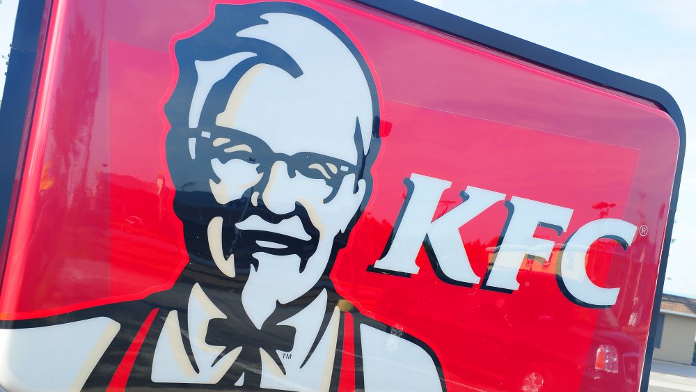
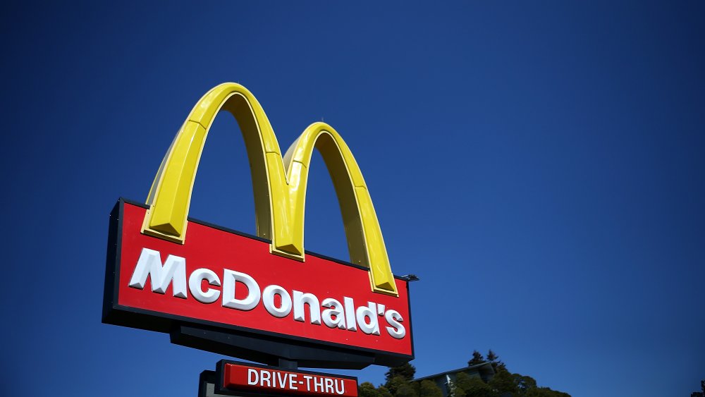
McDonald's, Chick-fil-A, Wendy's, KFC, Five Guys, and a ton of other restaurants... there are a lot of fast food signs that feature a heavy amount of red in their logos. In the world of fast food signs, Subway and Whataburger are the black sheep because they don't rely on red in their signage.
With a whole rainbow of colors out there to choose from, why do so many fast food signs insist on that bright, fire engine red sign? Is blue no good? Is green too boring? Does purple make people sick?
Marketing is a powerful tool in getting people in the door, as it turns out, and psychology plays a significant role in color choices when it comes to fast food.
Red is an attention grabber for fast food signs
When it comes down to it, red is so often on fast food signs because it's believed to grab our attention and trigger our appetites (via The Daily Meal). Those two things are pretty much essential when it comes to marketing fast food. Both the University of New Hampshire and the University of Winnipeg have conducted studies on the role that color plays in logos and marketing.
What they found was that our brains come to some sort of conclusion within 90 seconds of initial interaction with a product, logo, or person. When it comes to logos, upwards of 62 percent of our judgment is based on color. That giant red and yellow sign you see for McDonald's peeking up from trees along the highway is essentially saying, "Hey you, over here! Hungry?"
Red also tends to pop really well against white, which explains why brands like KFC, Chick-fil-A, Dairy Queen, and Wendy's employ it. According to Delish, the combination of red and yellow produces a "ketchup and mustard effect," which may just make you crave a burger.
So if red is so attention-grabbing, why doesn't every company use it? Well, according to marketing company Impact, blues and greens are cool colors that evoke emotions of trust and professionalism. This is why they're so often used by banks — and not fast food joints.