Taco Bell's Logo Used To Look Drastically Different
The images of fast-food chains are iconic and can often be detected without seeing the moniker of the establishment. Sometimes the logo catches our attention long before we see the words, proving just how important a brand's image is. Now, it can be easy to assume that the logos of our preferred food chains have always been that way since their inception. But, just as fast-food restaurants regularly remove or change menu items, they also switch up their logos and branding to keep things current.
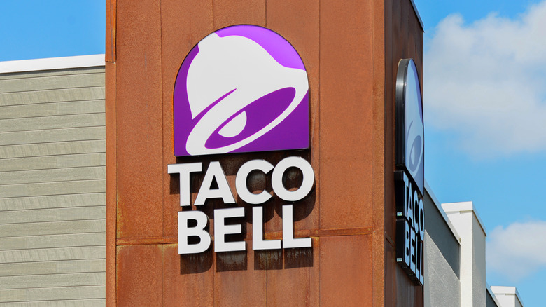
When it comes to Taco Bell, the image of an enlarged white bell on a purple background can be recognized anywhere, no matter the location of the late-night taco joint. But like many fast-food chains, the logo we now associate with Taco Bell is a far cry from its original design. According to Reader's Digest, when Taco Bell opened in 1962 in a 400-square-foot spot in Los Angeles, owner Glen Bell only offered up a handful of menu items. Although tacos were just one type of food on the menu, Bell decided to name his new restaurant after the tortilla-filled dish and his last name. However, most people would be surprised to learn that the bell logo that is ubiquitous with the brand wasn't part of the initial design. In fact, the bell wasn't introduced until nearly two to three decades later (circa 1984-1994), per The Man In The Gray Flannel Suit blog.
The original logo didn't have a bell
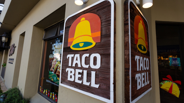
The initial logo consisted of each letter inside a box that was titled to spell out the name Taco Bell. The blocky letters would remain for a decade before the logo would get upgraded to the bell (via The Man In The Gray Flannel Suit). The first iteration of the bell debuted as mustard yellow, with a green mouth, red and orange backdrop, and the words Taco Bell spelled out in all caps directly underneath. As noted by The Man In The Gray Flannel Suit, the color schemes and overall design of the bell have changed over the years, but the bell, itself, has remained a Taco Bell signature since 1984.
Taco Bell's biggest (and most recent) update happened in 2015, nearly 20 years after the bell was first introduced. The upgraded logo also caused plenty of debate among fans, per Eat This, Not That! Perhaps you, too, remember a few neon-themed, glowing variations when the bell was a bright magenta color, the mouth of the bell purple, and the clapper yellow. Whether you like the current branding or the colorful logos of the restaurant's past, it's likely that you'll have to get used to a new logo in the future. Judging by its history, eventually, the powers-that-be at Taco Bell headquarters will give the company logo a new look in an effort to be current with the times.

