The Bizarre History Behind Burger King's Logo Design
Fans of flame-broiled burgers are no doubt regulars at Burger King, the fast food giant that started in Jacksonville, Florida, back in 1953. A lot has changed since those early days. BK introduced the oversized burger the Whopper, the brand grew to over 13,000 locations around the world, and the logo has also enjoyed some pretty important tweaks, per logomyway.
So, if the chain was already doing gangbuster business, why alter the logo to the tune of seven times already? Roadside visibility and consumer recognition are always top of mind to marketing executives, hence the repeated updates. Since BK has some pretty whopper-sized competition out there, the idea is to stay fresh, relevant, and easy to spot.
Originally known as Insta-Burger King, it also doesn't help that the company has been bought and sold a number of times, the most recent of which being in 2010 for $2.2 billion. Everyone knows that, where there's new management, there's often re-branding.
The Burger King logo's journey
The inaugural logo was designed in 1954 by the chain's very first owners, and featured a semi-circular sun above the name "Burger King" in bold, all-capital letters, says logomyway. When the brand was sold later that same year, the new owners changed it to only "Burger-King," with no other graphics in a custom font.
In 1957 the logo did a total about-face from that low-key version. The mascot, a king, is shown holding a beverage while sitting atop a hamburger. Below the colorful image is a sign reading "Burger King," then, "Home of the Whopper."
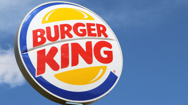
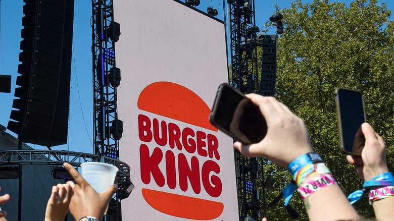
The logo underwent another redesign in 1969, the first to resemble the modern logo consisting of the brand's name between two hamburger buns. The colors were tweaked ever so slightly in 1994. Then 1999 saw the brand go a little crazy by changing the colors altogether and adding more flair to the logo via a blue circular line around the trademark buns. It lasted for 21 years, but in 2021 BK announced a return to the throwback, updated version of the simple name-in-between-buns logo from pre-1999, says de zeen. Through all that, the Whopper has stayed delightfully consistent, and that's what really matters, right?

