Reddit's Got Jokes About This Red Subway Sign
The popular restaurant chain Subway has been around since it opened the first store in 1965, then called Pete's Super Submarines (via The Washington Post). While the company is well-known and has many fans, it's also had its fair share of controversies, the most recent being the question of whether or not real tuna is being served in the subs.
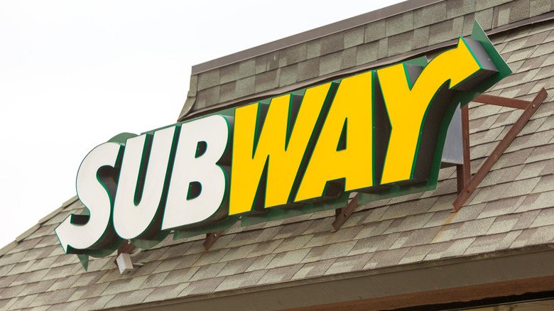
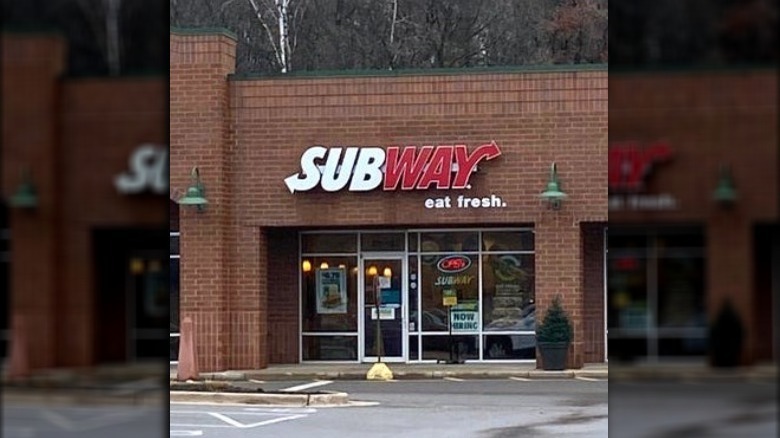
Now Subway is once again under the spotlight, but this time because of one of the location's signs. In the official Subway Reddit thread, user Epnew posted a photo of a Subway store where the "way" of the brand's name is written in red font. Traditionally, the sandwich chain's branding includes the "Sub" written in white followed by a gold "way," with slight design alterations occurring over the years (via QSR).
Without the original poster sharing any details about the location of this specific Subway restaurant, many Reddit users were left to discuss the possible reasons behind the change in branding in the thread. "It could be some weird city ordinance. In some towns, they require businesses to match a color theme which leads to odd stuff like this," one user wrote. The comment was one of the most upvoted on the thread, seemingly offering a simple, if not widely known, explanation for the sign.
However, others used the opportunity to crack jokes about the strange occurrence, and many didn't hold back.
Reddit users jokingly linked the red color to Communism and GameStop
There were plenty of jokes at the sign's expense, and users took the punch line in plenty of different directions. One of the most popular responses was a Redditor who jokingly connected the sign to Communism, saying, "Eat fresh, comrade...", which ended up being the most upvoted comment. It seems that many users had similar thoughts, likening the red in the logo to the traditional red seen in Communist symbolism. One user responded, "Not gonna lie. When I first saw the title of this post I thought the same thing too. That maybe it's located in a Communist country like China or Russia or Cuba or somewhere."
Others thought it resembled the "GameStop" logo just a little too closely. "GameStop but Subway," one poster shared. The GameStop logo features the same red color for the word "Stop," making the resemblance pretty uncanny. "Subgames, eat games," another wrote. Some just thought the logo gave off a creepy aura. "Bloodway," one wrote, followed by "Subway, eat flesh," from another. Of course, unless the original poster clarifies the location, we may never know why this strange Subway has such a uniquely colored sign. Thankfully, we at least got some good humor out of the situation.