The Real Reason The Arby's Logo Is A Cowboy Hat
The logo of a business is the first thing a potential customer notices when they pass by the storefront. An interesting logo may prompt you to stop in and, at the very least, browse. A great logo speaks for itself, with people immediately recognizing the brand. A billboard with golden arches along the highway makes you crave McDonald's. A picture of a green and white mermaid conjures visions of Frappuccinos and a cowboy hat might give you a hankering for roast beef. But wait, why does Arby's have a cowboy hat for a logo anyway?
Founded in 1964 by brothers Leroy and Forrest Raffel, a small-time roast beef sandwich shop from Boardman, Ohio, transformed itself into a brand name synonymous with giant, thinly sliced roast beef sandwiches. Arby's has a distinctive story behind its name and is based on the initials of the Raffel Brothers, as tweeted from Arby's in 2018.
But just what is the story behind the cowboy hat? Was there some sort of cowboy mascot, long-forgotten and buried by the public's collective consciousness? Are they trying to compare themselves to the cowboys of yore, driving heads of beef not across the plains but into the mouths of patrons? Maybe the answer isn't as complex as we think.
The cowboy hat represents the Wild West
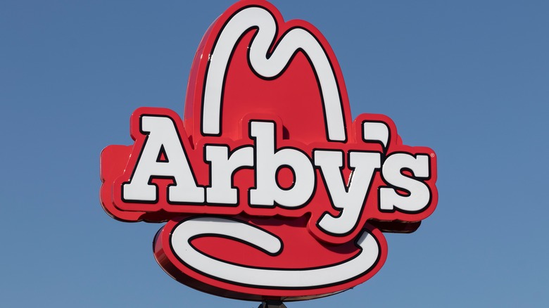
Arby's cowboy hat is simply meant to attract customers, and it works. Fast Food Menu Prices describes the logo as reflecting the "Wild West" nature of the restaurant — a claim that relates more to the very first logo of Arby's, which itself was a tall neon cowboy hat that advertised the delicious quality of Arby's sandwiches. Hatchwise sums up the logo as "classic," "modest," and "simple." It's a red cowboy hat with the company title written in white inside of the brim.
Of course, like any company, Arby's did attempt to change its logo back in 2012. The logo switched from 2-D hat to a glossy 3-D hat, with the "arby's" text in a flat lower-case font (via Design Shack). Surprisingly, some customers viewed the logo change with disdain, noting the chain sacrificed its unique style to try to fit into the boring corporate world of sterile, boring logos. Such was the dislike that Arby's changed their logo to one more inspired by the previous one (via Franchise 500). It seems that for some people, it's better to be true to your roast beef roots than try and join the crowd.

