RIP Toblerone Logo. Here's Why They Had To Change It
Brands influence our daily lives. We wake up and brush our teeth with a certain brand of toothpaste, eat breakfast food by brands that align with our needs and values, and use and interact with different products throughout the day. We make and associate memories with them. Unwittingly, they become the time capsules that remind us of what was and fill us with nostalgia.
Nostalgia is a powerful emotion, so when it's taken away from us in some manner, we react. When customers are loyal to a brand, they take notice of the change in its looks and feel, no matter how minute. This is one of the big reasons why redesigns are often met with severe backlash.
Aware of the risks involved, brands often redesign their logos or packaging to complement their new marketing strategies or to appeal to the ever-evolving consumer taste. Change is the only constant, and their need to reinvent and evolve trumps being subjected to trolls and criticism. Brands like Pizza Hut, Burger King, and Starbucks have all been there.
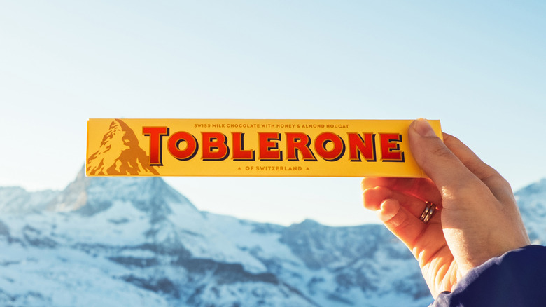
Sometimes, however, companies don't have the luxury of choice. Toblerone, one of the most famous chocolate brands in the world that spells nostalgia for many of us, will no longer have its iconic emblem on the packaging and there is nothing the company can do about it.
Toblerone can't keep its iconic mountain logo anymore
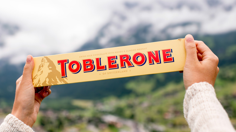
In 1908, Theodor Tobler of Bern, Switzerland, created Toblerone along with his cousin, Emil Baumann. They decided the chocolate bars would be triangular, an ode to the dancers of the Parisian cabaret music hall Folies Bergere who assembled into a pyramid formation to end their performances. The memorable logo depicting a mountain that represents Matterhorn, a famous pyramid-shaped mountain of the Alps near Bern, became the hallmark of Toblerone's promise of Swiss excellence.
In June 2022, Reuters reported that Toblerone chocolates would no longer be produced in Switzerland. Its owner, American confectionery giant Mondelez International, announced its plans to move some of its manufacturing to Slovakia to accommodate growth. The move came with a cost since the chocolate would no longer be truly Swiss. Adhering to the strict Swiss labelling rules that don't allow the usage of national symbols on products manufactured elsewhere, the packaging was changed to say "established in Switzerland" to replace the "of Switzerland." Now, the mountain logo will be modified, too.
"For legal reasons, we have to adapt our packaging to the Swissness legislation and, among other things, remove the Swissness notice on the front of the Toblerone pack," Modelez's spokesperson explained to NPR. The revised logo will reportedly represent a mountain with a modern touch and will retain the renowned Easter egg — the bear.
The internet has mixed opinions about Toblerone's logo change
After the announcement, the netizens took to various social media platforms to comment on Toblerone's logo change. Some users weren't having it. "Yikes ... I'm ashamed of my country right now for making the decision to get rid of the iconic Toblerone logo ... it's so sad ...," one Twitter user wrote. "Hvdes, they're taking away the Toblerone logo and it [makes] me sad. Been buying that for Grampa for nyon my whole life," another user tweeted.
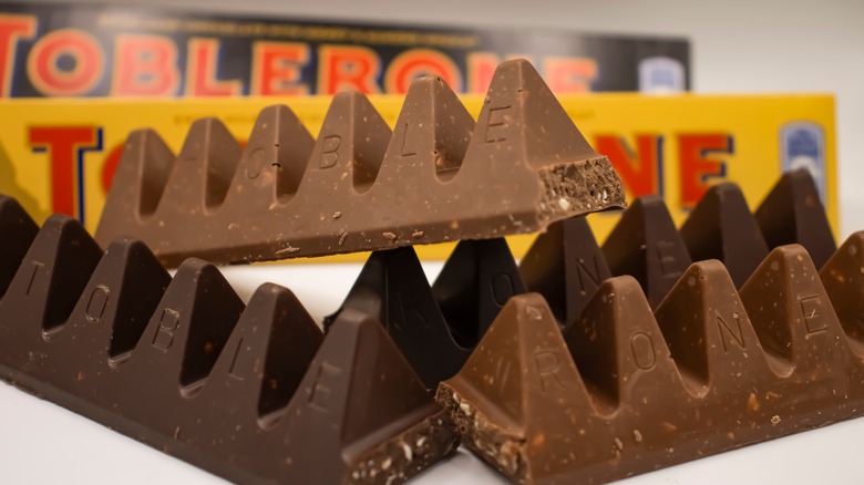
A third user said the logo change might cost the brand, writing, "'Distinctive new Toblerone typeface and logo.' Now that's gonna end up in tears, punters dislike change. Didn't they learn when they changed the triangle[?]" In case you didn't know, Toblerone decided to widen the gap between its triangular chocolate chunks in 2016 in response to the rising cost of ingredients, and some consumers weren't too happy about it.
Some netizens were more understanding of Toblerone's decision and applauded the Swiss law for taking strict measures to protect their products' integrity. "If they allow everyone to seem like they are producing Swiss chocolate anywhere, it won't mean a thing anymore soon," one Redditor wrote.


