This Viral Tweet Will Ruin KFC's Logo For You
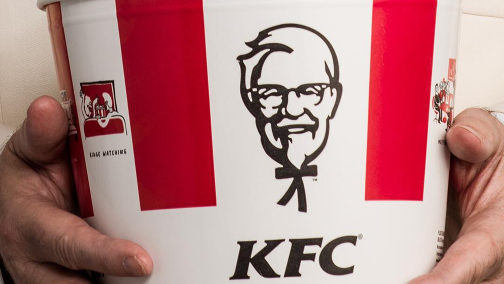
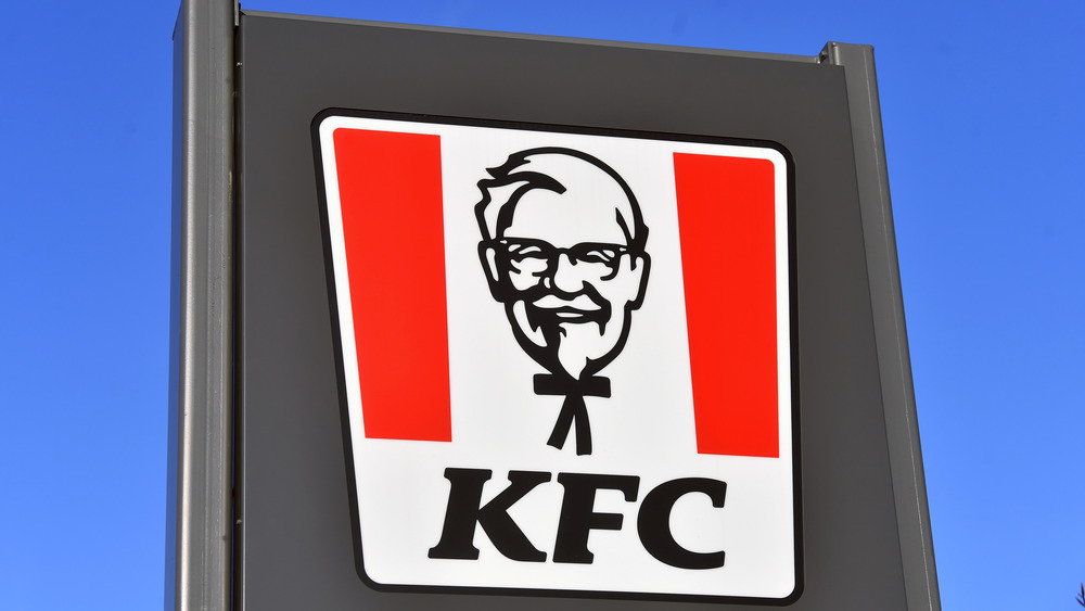
A viral tweet posted on December 15 revived an old meme about Colonel Sanders that will ensure you never look at KFC's logo the same way again. The famous logo is a detailed representation of the face of KFC's founder, Harland Sanders. At the bottom of the image is Sanders' highly recognizable black string tie, which he wore in real life so he would look the part of a colonel (via History).
Twitter user and magazine writer Freddie Campion reminded us there's a completely different way to look at this logo, especially if you look at it through the eyes of a child. "My wife just confessed that for her entire childhood she thought Colonel Sanders' bow tie was his whole body and now I can't stop seeing a tiny stick body every time I look at him."
Campions' wife wasn't the only person to innocently see the KFC logo as a big head on a stick-figure body. This meme is all over Pinterest, the website me.me, and similar sites that collect memes, accompanied with text that reads something like, "My little niece asked me, 'Why is his body so little?'"
A Reddit user posted the meme a year ago: "Why did they put so much detail in his head then just give him a stick figure body?"
The tweet started a conversation about other logo double-takes
Twitter users responded to Campion's tweet with their own double-takes on famous logos. Someone pointed out the arrow embedded in the Fed Ex logo. Apparently, a lot of people somehow see a man's profile in the USPS eagle logo. Another twitter user declared Campion's wife to be a genius and asked if she would interpret the Starbucks logo: "Does she have legs with little crab feet that she's trying to lift above her head? I don't get what's going on here."
Campion, meanwhile, tried to divert all the attention his tweet was getting to a charitable cause. "If you work at KFC and you have a GoFundMe to pay for medical bills drop the link here," he commented under his KFC logo tweet. "This has enough retweets now [more than 33,000 as we write this] that the people at KFC HQ have definitely seen it, so seems like a good opportunity to remind them they need to pay their employees a living wage."
KFC isn't the only fast-food chain with a logo that can be seen two different ways. The famous golden arches of McDonald's form the letter "M," certainly. But — believe it or not — a psychologist who consulted with McDonald's founder Ray Kroc convinced him to keep the arches because they also resemble a part of the anatomy that would instill a sense of maternal comfort in customers (via BBC).
Now you have two fast-food logos you won't ever see the same way again.

