54 Percent Of People Prefer Burger King's New Look Over McDonald's
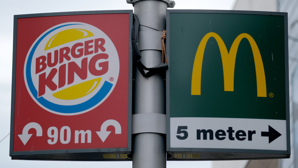
Burger King and McDonald's have been competing since the middle of the last century, and they'll never declare a ceasefire until one of them goes out of business or they both merge into a single entity in the distant future. Here and now, however, they are competing in just about any arena you can think of.
McDonald's usually tends to hold the edge when it comes to food — better fries, better breakfasts, even better soda (though neither chain's leading the pack when it comes to their signature sandwiches). Meanwhile, Burger King takes the crown for clever, creative ad campaigns. Most McDonald's commercials make the straightforward (if boring) point that their food is crave-worthy, you want it, and btw, if you do eat it, it will make you cool and popular. Burger King, on the other hand, seems to be going for a different reaction. Moldy Whoppers, cow farts, haunted bathrooms, say what? Upon occasion, though, they do hit one out of the park, as with the Finnish ad campaign where the King mascot — for once, not even a little bit creepy — came out during Pride Week to express his secret love for a long-time rival with a sweet kiss (via Media Daily News).
Soon both Burger King and Mickey D's will be making new changes, this time in their packaging. It would seem, according to a survey performed by Ad Age-Harris, that BK scores a big win here, as well (via AdAge).
Burger King's new wrappers are pretty "groovy"
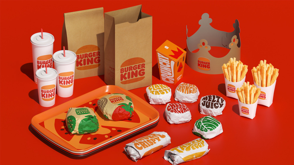
Burger King dropped its new designs in January, with McDonald's hot on their heels by early February. While the new logos will one day be featured on signage and uniforms as well as boxes, bags, and cups, AdAge did say that all these changes may take several years to roll out. Still, it's likely that within the next few months, you might start to notice some changes in your burger wrapper. So what, exactly, will you be seeing?
Both chains have opted for a more colorful look, but that's where the similarities seem to end. The McDonald's packaging is somewhat understated and traditional, with product names in fairly small script as well as a pattern meant to reflect the package contents: green and aqua waves for the Filet-O-Fish and a brown-and-orange design that vaguely resembles the Quarter Pounder with Cheese.
Burger King, on the other hand, went big and bold with a design many survey respondents called "retro," with one calling it a flashback to "the groovy sixties." Design elements include descriptive words such as "Flaky Tasty" and "Tender Crispy" as well as illustrations such as a vibrant red tomato adorning a sandwich wrapper. So what did the survey say? By a 54 to 46 percent margin, people preferred Burger King's new look. Better yet, nearly half of them said the swinging style change would make them even more likely to eat at BK. Score another win for the underdog King!