The Unusual Way Calvin Klein Requested His Daily Coffee
How do you like your coffee? Black? That's easy-peasy. With cream? Loaded with cream, more like coffee-infused half-and-half? Lightened with a milky, plant-based beverage? Sweetened with sugar, brown sugar, honey, maple syrup, stevia, or Splenda? Hot or iced? Cold brew, drip, pour-over, or French press? Decaffeinated? Let's not even go there.
Or maybe you're the type who walks into a Starbucks and generates eye rolls and noticeable tension at the counter with your order of a quad-shot espresso with soy milk, eight pumps of almond syrup, three pumps of coconut, and a shot-and-a-half of chocolate. Coffee is complex, and beverage orders have become extremely elaborate and annoying, not to mention expensive (per Newsweek).
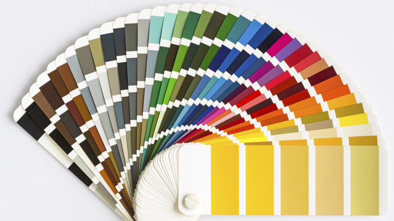
If you're a fussbudget when it comes to the color of your cup of Joe, you could always pull up the coffee and cream chart that set off a colorful conversation on Instagram when Delish posted it there several years back. Fashion designer Calvin Klein, a perfectionist down to the preparation of his coffee at home, might approve (per The New York Times).
Calvin Klein used a Pantone card for perfect coffee color
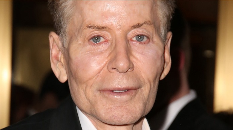
Calvin Klein is an icon of American fashion. He launched the clothing brand that bears his name in 1968, and it eventually expanded to include undergarments, jeans, and other products (per the Calvin Klein website). Klein's aesthetic as a clothing designer has been described as minimalist and casually chic, and he was known for being detail-oriented at work and at home (per The Baltimore Sun). The designer noted for a fragrance named Obsession was famously fixated on minute details, including the precise preparation of his coffee.
And it's not as simple as a tablespoon of cream or a spoonful of sugar. According to The New York Times, he kept a Pantone card in his kitchen so his chef could get the know what color to achieve when preparing Klein's coffee That meant achieving the right ration of cream and coffee, according to the Baltimore Sun. The Pantone Color Institute is widely known for its annual "Color of the Year” forecasts and for the development of a "universal language” of color that today is utilized by many industries, including printing, fashion, and food.
Pantone appears to have multiple colors related to coffee beans and coffee beverages (per Sprudge). We're not sure if Klein favored something dark like coffee beans or light like cafe au lait.