The Real Reason Retro Designs Are Coming Back For Fast Food Chains
In The Shawshank Redemption, Andy Dufresne says, "No good thing ever dies" (via Biography). Of course, he was talking about hope, not serif fonts, but the sentiment still applies. Eater recently ruminated on the resurgence of retro, specifically in one industry: fast food. It turns out, fast food companies might be trying to tug at the nostalgic heartstrings of the public in a branding sleight-of-hand.
Millennials and Gen Xers are making the purchasing decisions these days, and while they may be strapped for cash in this economically uncertain time, they also might be drawn in by the cheery brand design of their childhoods. At least that's what companies like Burger King, Pizza Hut, and KFC are banking on, according to Eater. Tumultuous times make people long for the simplicity, perceived or otherwise, of their youth, and nothing says "youth" to a '90s kid like fonts and colors from the 70s.
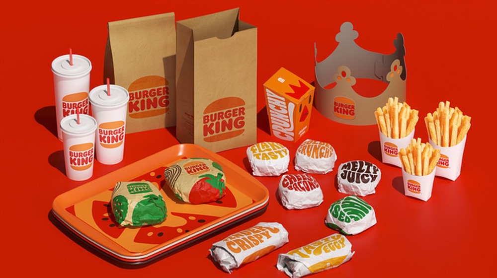
So why did Burger King take on its swinging '70s theme in early 2021 and why did Pizza Hut return to its classic logo (via Business Insider)? While brand redesigns are usually met with hesitation or backlash by the public, Debbie Millman, chair of the master's in branding program at the School of Visual Arts, told Eater that bringing back old designs is a "way to avoid that."
Fast food chains appeal to customers' nostalgia
An Eater article from 2019 explains that the design pendulum tends to swing back every 10 or 20 years, and the retro re-brands we're seeing in fast food these days are a response to the oversaturation of that Y2K look; you know, the clean lines, sterile typefaces and shiny, "futuristic" looking design that became popular around 1999, in anticipation of a new, exciting century. Now, 21 years on, we are desperate to get back to those charming, serif-y logos, the ones that look hand-drawn and imply that actual humans are involved in the companies we want to love.
In the age of fast food and fast fashion, perhaps the pendulum will hit its peak sooner than later. Maybe the wave of retro designs, which feel like such a welcome sea change now, will turn into next year's tsunami of brand copycats (via AdAge). Then, we'll be longing for those minimalist lines and sans serif fonts once again. But if we've learned anything after a year of lockdowns, it's that monotony is lethal, change is good, and no good thing ever really dies. Just give it 10 to 20 years, and it will be back.