This Drawing Will Ruin Chick-Fil-A's Logo For You
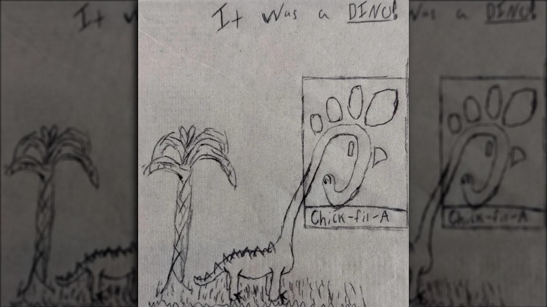
There are some things you just can't unsee after you've seen them, so you might want to consider that before you go any further with this alternate take on the Chick-fil-A logo. For once it has been seen, you will not likely forget it anytime soon. Perhaps the chicken chain's logo is so ingrained into its customers because it is literally built into the name of the brand. Regardless, one Redditor's re-worked drawing of the Chick-fil-A logo is imaginative to say the least.
In the Reddit thread, the original poster shared a photo of the sketched logo, but it has been turned into a dinosaur. The curly top of the "C" is the long neck of some kind of sauropod with the feathers and the beak of the original logo chicken becoming spikes or plates, along the dinosaur's long neck. The original poster added a smile face to the inner curled part of the "C" and extended the end of the letter into a drawing of the body. They even added some grass and a palm tree behind the dinosaur.
This is what other Chick-fil-A fans think about it
While the Chick-fil-A logo has certainly changed over the years, the most recent change was in 2012, when the beak became more stylized (via The Chicken Wire). Though the logo you know and love today was once quite different and even stood on its own in front of the brand's name, no one on Chick-fil-A's team likely ever envisioned it as a dinosaur. While the original poster on the Reddit thread is clearly happy with their handy work, other fans and commenters had some mixed feelings.
Some were all for the illusion. One person commented on the post, "always has been." Another added, "birds are dinosaurs." So, they're clearly on board with this new take on the logo. Others were less enthused with one person simply writing, "why lol." Whichever side of the adapted logo you land, chances are it will be a while before you forget this mind-bending twist on Chick-fil-A's ubiquitous logo.

