The Symbol You May Not Have Noticed In The Subway Logo
Many Americans are familiar with the concept of Easter eggs in movies and music videos. Producers hide little details, either to hint at connections between movies or just to add some fun for viewers. Disney fans can easily spot Rapunzel and Eugene's brief appearance in "Frozen" or Mrs. Potts and Chip in "Tarzan."
Some restaurant chains also make use of hidden symbols. The Burger King sign looks like a burger, and Baskin-Robbins' logo sneaks in a "31" for the franchise's 31 flavors. In both instances, the Easter egg says something about the restaurant and adds to the aesthetic experience of dining.
Subway's logo also has a sneaky symbol in it. Infamous for its not-quite-a-foot footlong, Subway is "dedicated to producing the highest-quality, safest, and best-tasting sandwiches and meals in every part of the world" (via Subway). The chain's plans for sustainability might just show up where you would not expect.
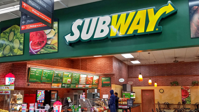
Subway's logo explained
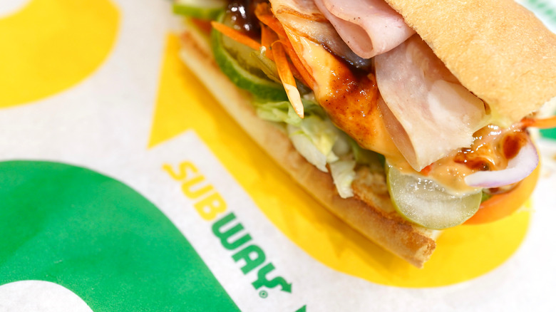
According to Taste of Home, Subway's logo hints at its origin aesthetic: the subway used for transportation. The logo starts and ends with an arrow, referencing the entrance and exit signs you might see when using public transportation. Even Subway's shortened logo, just an S, is made up of two arrows.
Arrows commonly symbolize movement, a meaning not lost on the chain's design team. "The Subway brand is recognized throughout the world, and this (symbol) reinforces our commitment to staying fresh and forward-thinking," said Subway president and CEO Suzane Greco (via Business Insider).
The arrows included in the Subway logo represent not only the subway station aesthetic, but a chain-wide commitment to sustainability and progress. Don't believe us? Pay your closest Subway a visit and check out its logo, as well as the newest additions to the menu. July 2021 saw the introduction of new toppings, new subs, and new revamps of old favorites, just the beginning of the chain's freshening up.

