The Doritos Logo Used To Look A Lot Different
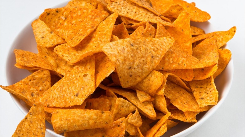
Doritos have been a longtime favorite in many of our childhoods. We love them for their delicious flavors, which now range from Spicy Ranch to Chili Cheese Nacho (via Doritos). But no matter the variety, you can easily spot a Doritos chip, as they always come in the iconic shape that is both flat and triangular.
According to a Quora user Christopher Stanton, this design choice was made so that it appeared that the chips were directly cut from a tortilla. The shape of a Doritos chip has become so well-associated with the brand that a teen in Australia who found a puffed chip in her bag was offered up to $20,000 by PepsiCo for her abnormal discovery. Furthermore, there was even a redesign concept for the brand that went viral, in which the word "Doritos" was completely removed from the hypothetical logo, which just included the triangle (via Dieline).
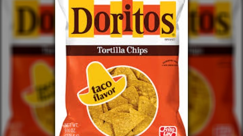
The original Doritos logo
So it may come as a surprise to you that the original Doritos logo did not include the unique, bright-orange triangle shape like it does now. This is probably due to the first Doritos chips looking very different from the ones today, as noted in an article by HuffPost. Furthermore, So Yummy states that the popular Nacho Cheese flavor was not released by the company in its early years.
However, the original Doritos logo used a similar palette of colors as its emblem today. The name of the company is spelled out in giant, serif letters on top of blocks that are colored yellow and orange. This color scheme matches the one in the triangle shape on present-day Doritos bags.
While the old Doritos logo is fun to admire, we're happy for the change that inspired the chip company to update its trademark image — the creation of more tasty products.

