Baskin-Robbins Might Look Different The Next Time You Visit. Here's Why
After nearly eight decades of doling out ice cream, it appeared to be high time for Baskin-Robbins to bring its look into the 21st century. Or maybe the 20th. Its decision to hit the "refresh" button means things may look more than a bit different the next time someone walks into a Baskin-Robbins ice cream parlor.
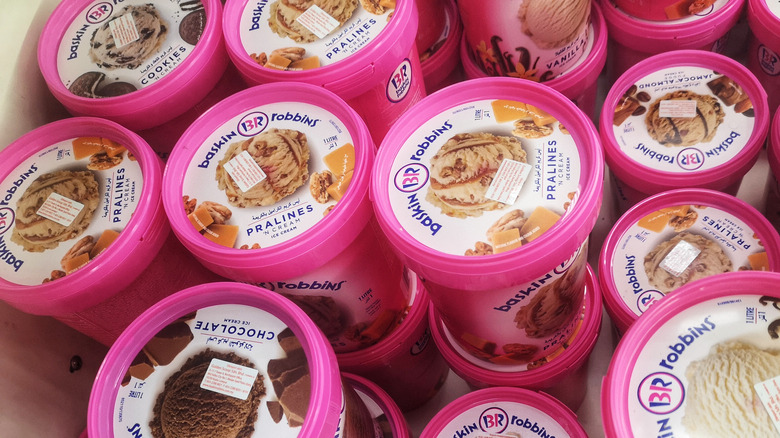
The brand is choosing to retire its familiar bright pink and blue logo and return to the color scheme used in 1953 – when the company that Irvine Robbins and Burton Baskin started in 1945 officially became Baskin-Robbins. Back then, the logo's colors were pink and brown. As Baskin-Robbins' Vice President of Marketing and Culinary Jerid Grandinetti told CNN, "The original advertising campaign in 1953 was built around circus iconography." AdWeek says Baskin-Robbins even used that look from 1947 to 1991, and it will be coming back. So it won't just be seen in Baskin-Robbins' employee uniforms but in packaging, too.
Some things are staying the same for Baskin-Robbins' branding
What isn't going anywhere is the number 31, which is very cleverly embedded within the letters "B" and "R. It appears retiring "31" was not a discussion anyone wanted to have - even though the number of ice cream flavors Baskin-Robbins has offers now has far exceeded figure. The tally is now in the hundreds, per CNN.
"We have so much equity in that 31, and we can continue to really tell a great story about offering great flavors across a range of products," Grandinetti said. "It was never really in the consideration set to move in a new direction, but to do it in a way that obviously is a little bit more modern and cuts through that competitive clutter." The move to modernize is important to Baskin-Robbins, especially because while nostalgia plays a role in its appeal to older customers, Baskin-Robbins now needs to find its way among the younger generation.
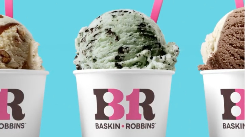
Part of this may be seen in the three trendy new flavors that the brand has introduced along with its relaunch: Non-Dairy Mint Chocochunk, Ube Coconut Swirl, and Totally Unwrapped, which brings peanut butter and chocolate ice cream in a mix, and studded with extras like fudgy pretzels and a salted caramel swirl.
Baskin-Robbins has a new tagline
The iconic ice cream brand isn't just refreshing its look. It has also rolled out a new tagline, inviting ice cream fans in general, and Baskin-Robbins fans in particular, to "Seize the yay" by showing appreciation for life's moments. The iconic ice cream brand's Vice President of Marketing and Culinary Jerid Grandinetti explained the new tagline in a press release, saying, "Small moments that spark joy often get taken for granted. We're encouraging people to pause and celebrate any moment that brings happiness with Baskin-Robbins."
While the overall rebrand appears daring and audacious, AdWeek says the exercise actually forced Baskin-Robbin's senior executives to take a look in the mirror, and unfortunately, they didn't like what they saw. "We were known for quality, but we weren't necessarily considered innovative and modern," the ice cream brand's vice president of marketing said. "We wanted to make sure with the campaign that we leaned into changing the perception of the brand, embracing the things that we're known for and positives, but getting away from some of those negatives. At the same time, it was really important for us to make sure it was an authentic campaign."