The Ill-Fated Move That Cost Tropicana More Than $50 Million

It's not hard to lose money in the food industry. Food is susceptible to shifts in consumer spending, inflation that cuts away at margins, and crop failure (which is why orange juice will get more expensive in 2022) – just for starters. But one of the most painful ways of losing money is when you've invested a fortune in an expensive rebranding intended to make you more money. As the market gets more saturated, and competition increases in intensity, even industry leaders look to advertisers and brand-builders to stay current. Sometimes, however, rebranding can go horribly wrong. That's what happened over at Tropicana when they tried to reconfigure their famous orange juice carton. The storied brand's example is so bad it's actually considered a textbook case of what not to do. : they paid $35 million to Arnell Advertising for the rebrand: The new juice carton launched in early January 2009 (per Crème de Mint). From that time until February of the same year, they lost another $20 million in a month's worth of sales before scrapping the new design and going back to the original packaging.
Just what made Tropicana's rebrand such a spectacular failure? It seemed like such a good idea at the time — at least to many people. The intention was to modernize the Tropicana logo and emphasize the fresh-squeezed element of the juice. The rebranding was seen as a more elegant and clever alternative to the original carton.
Where's the orange?
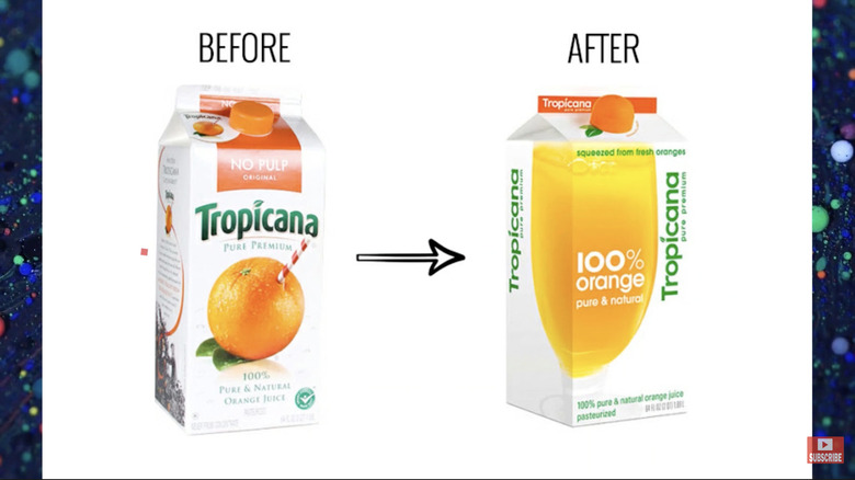
What changed with Tropicana's new branding? Pretty much everything (per Better Marketing). The orange and its straw which had formerly graced the front of the carton was eliminated, as was the "Pure Premium" wording which was replaced with "100% Pure and Natural Orange Juice." The brand name itself, instead of reading horizontally across the front, was shifted vertically along the side of the carton. The familiar orange image was replaced with a large glass of juice, which took up two sides of the carton, dominating the front and one side panel. The lettering, too, was changed: the Tropicana "T" was no longer reminiscent of a palm tree with its vaguely curved lines; the font was streamlined for a new, cleaner look. The cutest element of the new design was a rounded, orange-shaped cap on the spout, which gave the impression of squeezing the juice as you unscrewed the top. But overall, the carton was definitely not cute. It was radically simplified and modernized; it represented a dramatic shift away from the look familiar to Tropicana drinkers.
The response to the shift in packaging was swift and terrible: Many consumers stopped buying the product (per AdAge). What went so horribly wrong? Analyses have abounded in the years since the famous flop, but there is consensus around a few key elements (leaving aside the question of whether it's really the best orange juice brand out there).
Too much, too fast, and too unclear
According to Branding Journal, one issue was that Tropicana went overboard with all the changes. So much of the original design was transformed that consumers simply didn't recognize the product. Tropicana was seen as a high-end product, and the orange and striped straw were its signatures; the new package eliminated both. The new packaging was also much harder to read: The sideways lettering made it challenging to parse out the brand name without tilting your head — decidedly awkward when standing in a supermarket (via Better Marketing). Many people found it simply unattractive and thought it looked like a cheap supermarket brand (via Branding Journal) rather than the quality juice they were accustomed to.
It's also worth thinking about the nature of the product itself, and the image shift from an orange to the juice itself (one of the main innovations in the project, on which Peter Arnell prided himself, per Better Marketing). Juice is inherently vague-looking. Showing an image of an orange is much more convincing than an image of the juice itself since it's the fruit that's the selling point of the juice, not the other way around (as noted by Better Marketing). Strangely, the juice feels abstract while the orange itself is solid and concrete. The juice could come from powder, but the orange sure couldn't. And abstract products don't sell. Orange you glad they went back to the old look? Tropicana sure is.