How McDonald's Uniforms Have Changed Over The Years
We may receive a commission on purchases made from links.
Behind the scenes at countless McDonald's restaurants, there's an entire team of dedicated employees who work tirelessly to ensure that every visit is an exceptional one. And their uniforms play a crucial role in setting that stage.
From the classic red and yellow stripes that evoke a sense of nostalgia to the sleek and modern black and gray designs, McDonald's uniforms have evolved hand-in-hand with the ever-changing tastes and expectations of society. They have become a visual representation of the brand's commitment to staying relevant and adapting to the needs of their employees and customers.
As McDonald's has shifted its focus towards offering a more fashion-focused and sustainable-driven experience, the uniforms have followed suit. The designs have become more contemporary, reflecting a sense of professionalism and attention to detail. Each element of the uniform, from the sleek polo shirts to the stylish caps, is carefully crafted to create a cohesive and polished look that embodies the brand's values.
But it's not just about aesthetics. McDonald's understands that its employees are the face of the company, the ambassadors of the brand. Here's the why and the how behind McDonald's iconic uniforms and how they've changed over the years.
1950: Paper hats and sterile white
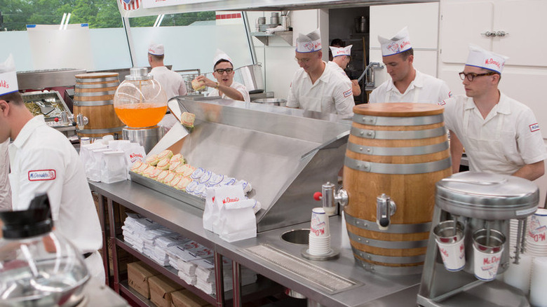
In the early days of the golden arches, long before celebrity designers and $5 hamburgers made their mark, McDonald's had a clear mission: providing guests with a restaurant experience that was clean and hygienic. To bring that mission to life? The staff uniforms were kept simple and pristine. A sterile white button-up shirt, paired with an apron, formed the foundation of their attire, with a disposable paper hat perched on top.
So what was the reasoning behind the all-white look? It was a clever strategy to portray the burger-flipping staff as impeccable employees in a pretty informal setting. Particularly in the aftermath of World War II, when concerns over sanitation and food safety were at the forefront of everyone's mind, emphasizing hygiene became crucial. The uniform was stripped down to its bare essentials, ditching all the fluff and frills. It was a sleek look that screamed clean.
As Restaurant-ing Throughout History explains it, the adoption of standardized white uniforms carried a deeper symbolism. It symbolized the restaurant industry's quest for legitimacy. And for a budding McDonald's, it meant going the extra mile to standardize every aspect, even right down to the uniform.
1955: White with Speedee bolo ties
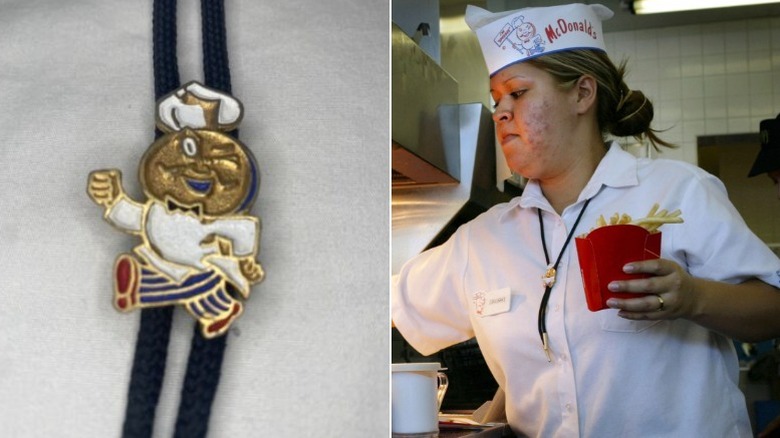
With businessman Raymond Kroc driving McDonald's transformation into an iconic chain, the potential for growth was only just beginning and the uniform had to follow suit. The restaurant, initially owned by brothers Richard and Mac McDonald, had already earned a reputation for prioritizing service and speed. But to keep up with their ambitious vision, the uniform needed a transformation. And in 1955, that transformation came in the form of a white tee with a bolo tie proudly showcasing a golden, winking mascot.
Speedee, the original mascot with a chef hat atop a winking hamburger face, epitomized the company's unwavering dedication to quickness. His signature face sat proudly on every worker's bolo tie.
According to Michael Stern, co-author of Encyclopedia of Pop Culture, "speed in terms of getting what you want when you want it" had become a defining feature of the post-war era where people were eager for the good life that meant getting what you wanted quickly and efficiently.
Unnecessary and restrictive additions like aprons were a thing of the past. The new uniform embraced simplicity, enabling the workers to move swiftly and effectively, aligning with the brand's commitment to delivering fast and reliable service.
1973-1975: Clinical two-toned blue uniforms
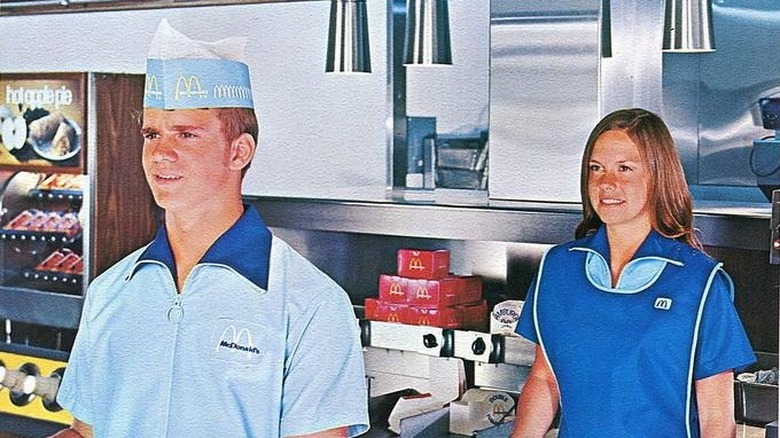
The 1970s brought with it a shift towards hospitality and courtesy in fast food and it was time for McDonald's to step up to the plate. Enter the Unimark International design agency which pitched design ideas to the fast food chain, including redesigning its uniforms. McDonald's wasn't too thrilled about Unimark International's designs for the uniforms and thought of them as rather boring. So, the designers went back to the drawing board and came up with a solution that would ultimately take over the brand from 1973 to 1975 — two-toned blue uniforms. Employees across the country traded in their classic white garbs for the rather clinical look.
The first uniform was a blue crew shirt with a full-length zipper closure, wide wing collar, short sleeves, and McDonald's Golden Arches insignia, while the second piece was a smock-like navy tunic apron intended for use when cover-ups were needed. While the blue uniforms were only around for a handful of years, they marked a defining period in McDonald's history towards courtesy and hospitality. As a 1970s training video told its future blue-wearing employees, "Courtesy is more contagious than the flu."
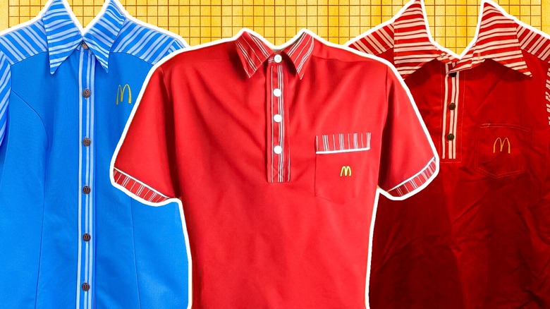
1976-1979: Solid with a splash of stripes
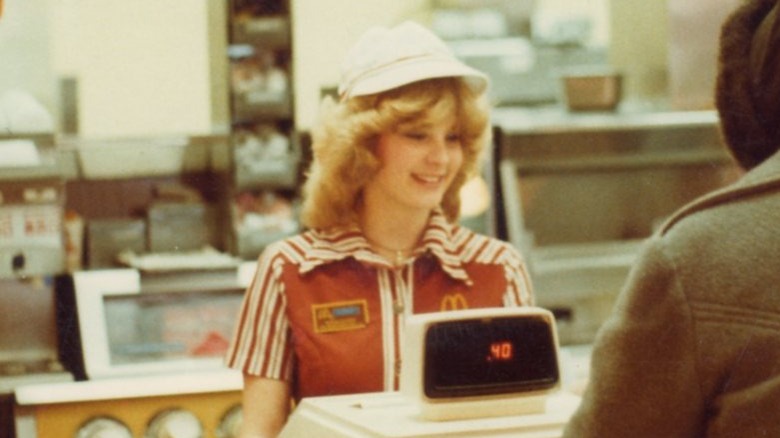
In 1976, McDonald's unveiled a whole new side to their brand — one that embraced fashion as a statement. Designed by renowned celebrity designer Stan Herman, this fresh look featured a solid shirt adorned with the iconic mustard yellow arch insignia, complemented by stripes lining the collar, buttons, and sleeves. Herman, in an interview with CNN, revealed that the aim of the new uniform was to forge a stronger, more unified brand image for McDonald's that was enjoyable to wear. "The most important thing is likability," he emphasized. "If a corporation walks around in uniforms they don't like, they become a grumpy corporation."
The 1976 uniform design was a true standout, with its vibrant colors and unique style capturing the '70s groovy imagination. It swiftly cemented its place as one of the most memorable uniforms ever worn by McDonald's employees with many for sale on Etsy, eBay, and more. This bold step into the realm of fashion merged with work attire marked a significant departure for McDonald's. It was a conscious effort to create a uniform that exuded both style and memorability in a way that the fast food chain had never done before.
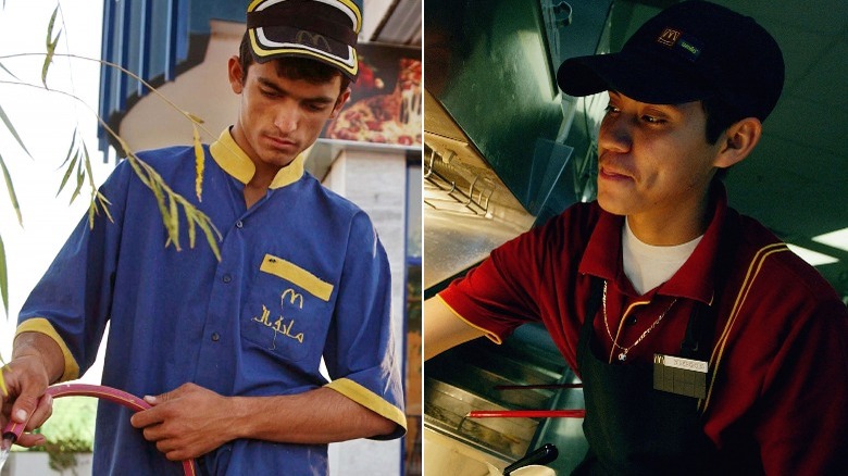
1980-1990: A franchise choice and a little bit of everything
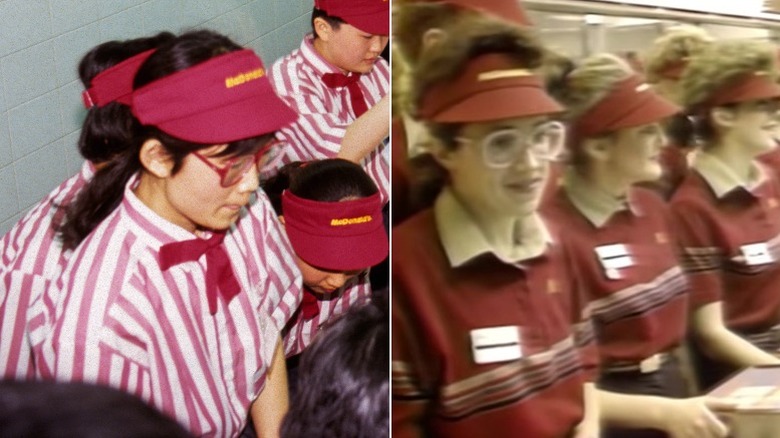
The 1980s and the 1990s was a time of independence for the Golden Arches. Franchises had choice over uniforms, McDonald's sold pizza, and its character, Big Mac, was a stool you could sit on in some lucky locations.
The McDonald's uniforms incorporated varying styles depending on the franchisees' preferred look, a change from the company-wide uniforms of previous years. As McDonald's expanded its reach across borders, it recognized the importance of blending in with the cultural and social fabric of each location. One of the most prominent uniform styles was Stan Herman's fashionable button-up solid stripe look from 1976. Notably, managers also stood out in brown vests paired with a crisp, long-sleeved white chambray button-up, highlighting their leadership role within the restaurant.
On the other hand, some franchises chose to switch up the uniforms entirely. Take Moscow for example, at the city's very first McDonald's location, staff members wore a minimal polo design with a white collar, three grey stripes, and a golden McDonald's insignia with red visor as a hat. This design was also popular in other McDonald's franchises in America.
As the 1992 Olympics rolled around and McDonald's stood out as a sponsor, some franchises opted to maintain a classic and professional look. They stuck with the tried-and-true button-up uniform, characterized by neatly buttoned shirts and tasteful, solid-colored bowties.
Early 2000s: Professional and polished
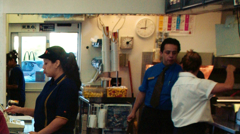
In 2002, McDonald's made a bold decision and broke free from its well-established retro-inspired look that had become synonymous with the brand. This change wasn't just about superficial style updates; it was a deliberate and strategic effort to propel McDonald's image and reputation into the modern era while help defining its new, healthier menu.
With a renewed focus on delivering an exceptional dining experience that exceeded the ordinary expectations of fast-food establishments, McDonald's took an active step towards a more professional and polished appearance. The fast food chain understood the significance of first impressions and understood that presenting its employees as neat and well-groomed would instill a sense of confidence in the service quality it provided.
Some locations took it a step further, embracing short sleeve button-ups, snazzy black baseball caps, and ties to elevate the professional aesthetic. The iconic McDonald's logo was carefully embroidered on the left side of the shirts, adding a touch of sophistication to the overall design. No matter the location, one thing remained consistent: a cohesive color scheme that fostered a sense of unity within the brand.
2005: The MTV generation
It was in a revealing conversation with the Chicago Tribune where a McDonald's spokesman spilled the beans on the 2005 plan to change up its uniform game yet again (per GoUpstate). The restaurant chain was hunting for designs that would capture the essence of its groundbreaking strategy — a strategy that aimed to embody the "forever-young lifestyle." McDonald's wanted to connect with the appeal of hip-hop and infuse its restaurant staff uniforms with a hip, contemporary look that would turn heads and win over the younger crowd.
To bring this vision to life, McDonald's enlisted the expertise of industry heavyweights, including the illustrious Steve Stoute from Translation, a brand imaging firm known for its work with music artists such as Jay-Z and Beyonce. With the collective experience, they embarked on a thrilling creative journey, breathing fresh life into the uniform design.
Chambray button-ups were out, stylish, breathable polos were in. The goal was to strike the perfect balance between the modern world and nostalgic charm. McDonald's drew inspiration from the vibrant and iconic uniforms of the 1950s and '60s, infusing them with contemporary elements. The aim was crystal clear— to transform every staff member into a walking ambassador, embodying the spirit and style of McDonald's.
2012: The Olympic fit
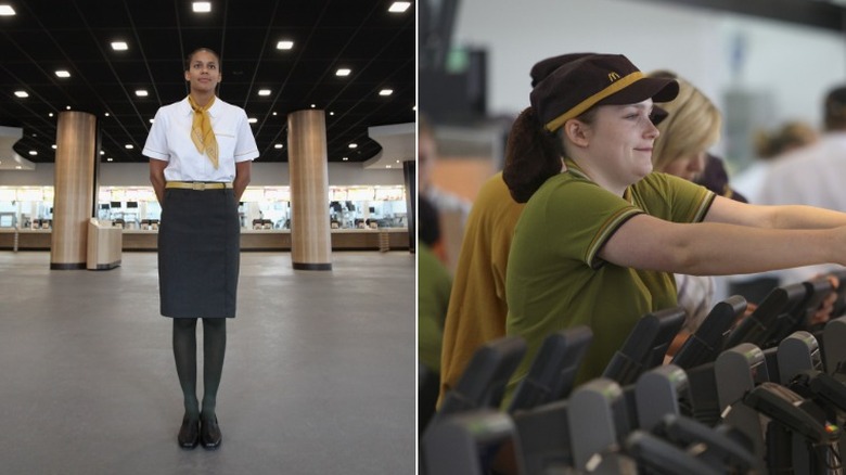
In 2012, McDonald's decided to give its uniforms a classy makeover just in time for the Olympics. With the creative genius of British designer Wayne Hemingway at the helm, the uniforms underwent a stunning transformation, blending elegance with timeless charm. And guess what served as the inspiration? The iconic 1960s TV series, "Mad Men." The new uniforms didn't just look good — they exuded confidence and sophistication.
Picture managers strutting their stuff in chic pencil skirts paired with vibrant mustard yellow handkerchiefs, and other employees wearing sleek skinny ties and stylish plaid button-ups that added a touch of class. Frontline workers rocked Fred Perry-style polo shirts, epitomizing the timeless style. McDonald's also took a bold leap by embracing unconventional colors. Mustard and "gherkin" green shades replaced the traditional red-and-yellow scheme we all knew so well.
This innovative choice reflected the company's willingness to explore new horizons and break free from the norm. And sustainability? McDonald's had that covered too. It introduced a groundbreaking "closed loop" system, making it the first U.K. fast-food chain to adopt such an approach by crafting the uniforms from 100% recycled fabric and collected right from its stores to minimize waste.
2017: The rise of grey monochrome
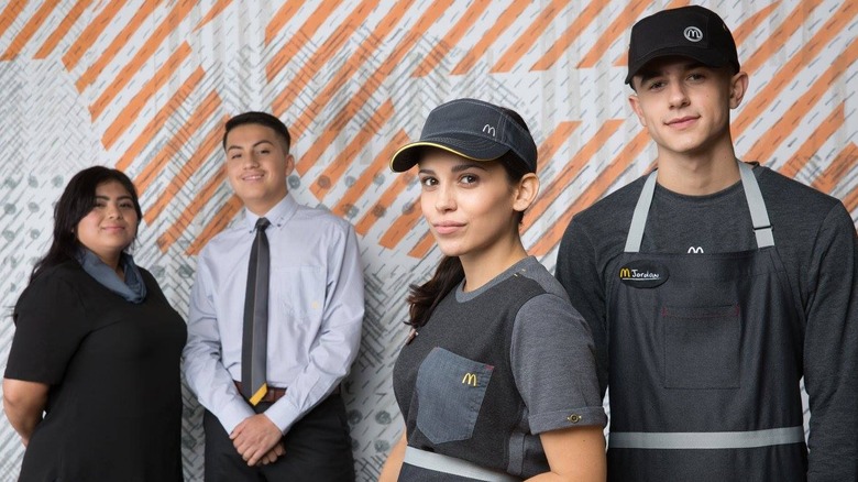
Back in 2017, McDonald's decided it was time for a uniform makeover that would shake things up and get people talking. Out with the old, and in with the new gray-toned uniforms, hats, and aprons that took a more laid-back and monochromatic approach. The colorful and vibrant image we all associated with McDonald's suddenly got a modern twist. Designed by the talented duo Waraire Boswell and Bindu Rivas, these new uniforms certainly made a statement.
Some employees and the public were quick to embrace the fresh and trendy look. But there were also those who couldn't help but draw comparisons to their favorite sci-fi flicks like "Star Wars" or "The Hunger Games," with one Twitter user even going as far as calling the uniforms "as dystopian as you can imagine."
Despite the differing opinions, McDonald's had a clear mission in mind: empowering their employees to feel confident and professional. They wanted to bridge the gap between fashion and function, making sure their team members looked sharp while delivering top-notch service.
Interestingly, the introduction of these gray uniforms reflected a broader trend. Gray had become a go-to neutral shade during challenging times, and McDonald's wanted to stay in sync with that choice. Even though some playful teasing happened online, the uniforms were designed to give off a contemporary and professional vibe.
2023: Neutral colors and unique looks for every worker
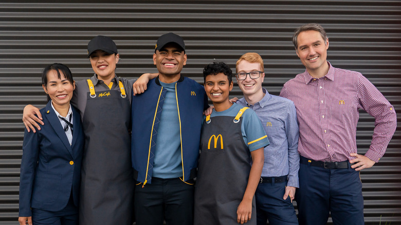
In 2023, McDonald's is going forward with a new uniform style that puts comfort above all else. The uniforms are designed to create a cohesive and stylish team image, the collection draws inspiration from both current and vintage sportswear trends. The color palette features soft blues, cool greys, and pops of golden yellow, embodying the iconic brand's signature colors while staying modern.
The crew tees embrace flexibility and comfort with their single-knit jersey fabric. Polos prioritize breathability, thanks to cotton-backed pique knit fabric. Jackets and pants blend high-quality cotton, elastane, and recycled polyester for durability, stretch, and sustainability. Managers' shirts offer a cool and comfortable fit with cotton-rich poplin fabric infused with recycled polyester.
In its commitment to sustainability, McDonald's reduces plastic bag usage during delivery and incorporates recycled polyester in the collection. Collaborating with BlockTexx, a leading textile recycling company, the uniforms are given a second life through their recycling program. Overall, each garment in the 2023 collection weaves together functionality, and sustainability while bringing the brand into a modern age of comfort and style.