The Pepsi Logo Used To Look A Lot Different
Pepsi has been around for a very long time. In 1893, the fizzy drink was created by a North Carolina-based pharmacist named Caleb Bradham who originally sold the soft drink under the name Brad's Drink (via 99designs). Then, in 1903, Bradham secured a patent for a drink called Pepsi-Cola that would be made from two ingredients — pepsin and cola nuts. But a name change isn't the only difference Pepsi has seen. Over the span of the drink's 100-plus-year-long journey, the brand's logo has seen significant changes.
The very first Brad's Drink logo had the name of the drink written in blue within a blue border and against a white backdrop. Since then, the logo has undergone 12 major changes and that's not counting the logo changes that Pepsi variants like Pepsi Max have undergone (via Logomyway).
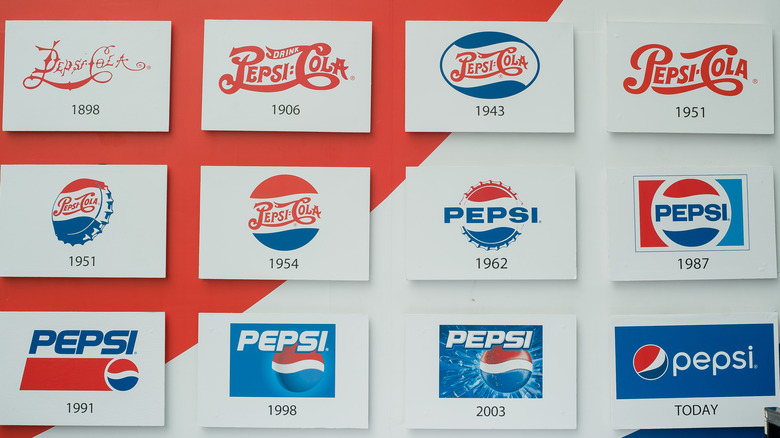
The first significant overhaul the logo saw was when Bradham changed the name of the drink from Brad's Drink to Pepsi-Cola. The new name obviously needed a new logo and ultimately, in 1898, a logo with Pepsi-Cola written in a swirly red font against a white background replaced the Brad's Drink logo. The Pepsi-Cola logo was quite similar in appearance to the red script of its main competitor, Coca-Cola. However, according to HuffPost, this type of font was very popular at the time and many brands used a similar one.
The Pepsi logo largely remained the same until the 1940s
The logo was mostly unchanged until the 1940s, aside from a handful of minor tweaks that included an increase in the size of the font and the word "Drink" added next to Pepsi-Cola (via Logaster). The next big change happened in the 1940s. At that time, they decided to add the blue and white from the American flag to Pepsi's red logo and place the colors onto the design of a bottle cap. The new logo also distinguished Pepsi from Coca-Cola.
The next significant change came about in the 1960s when the Pepsi logo started looking more like it does today. The word "Cola" was removed, leaving only the word "Pepsi" in a solid blue-colored font instead of swirly red (via Huffpost).
Towards the 1970s, Pepsi started leaning into a minimalist design. And, over the next two decades, they rearranged the placement of the logo's colors and experimented with the style of the font. In 2005, Pepsi replaced its plain flat logo with a 3D design that had a blue background, Pepsi written in white, and a small globe with red, blue, and white colors underneath.
The logo that we associate Pepsi with now came about in 2014 when the company decided to replace its 3D design for a flat one. But, considering Pepsi's history of reinventing its logo designs with time, chances are the Pepsi logo will look nothing like it does today a century from now.

