What Does The Panera Logo Really Mean?
When looking at the history of fast food restaurants, there's more than meets the eye behind the cashiers and the dimly-lit menu signs. For example, Chick-fil-A has invented a secret menu and the first McDonald's actually has a pretty interesting origin story.
Another fast casual business in particular has an intriguing history: Panera Bread. In addition to its original name evolving from Saint Louis Bread Co, Panera's logo also went through a great deal of evolution throughout the years, from a black-and-white logo to its current earthy design.
According to Taste of Home, the company deliberately chose the graphic's colors to show off a natural and home-y vibe. In addition, the chain had recently made its logo larger in order to reinforce its brand identity to its customers, according to CNN. In fact, Panera's logo has its fair share of symbols. Here is exactly what corporate headquarters want its customers to feel when they look at the Panera logo.
Panera Bread's color choices are meaningful
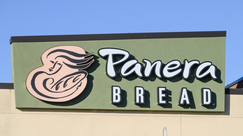
Panera Bread is known for its green and yellow logo. However, the Missouri-originated chain didn't always follow this color palette.
According to Taste of Home, Panera utilized a black and white logo from 1987 to 2005. The yellow in the logo was then added on to give it a warmer feel. The color specifically covers the image of a woman and the bread she is holding, which serves the purpose of making customers feel warm and invited. The woman on the logo, or, "Mother Bread," was created by Heckler Associates, according to Money Inc. Sourdough experts will know that the starter of the bread, which is first pulled off before baking so that the loaf can properly ferment, is also called the "mother." So, Money Inc. describes, both "Mother Bread" and the loaf in her arms symbolize the careful process of creating bread for Panera Bread.
The Panera logo evolved in 2019, per Taste of Home, when the bread was replaced with a wheat. Then, the business decided to go back to the original graphic in 2020 with a loaf, and Mother Bread now facing the front, breaking bread, and displayed on a green backdrop in the shape of an arch, per Logos-World. Taste of Home reports the purpose of this design choice was to symbolize the shape of an oven. In addition, the new green background had the mission of displaying the brand's commitment to serving natural ingredients.

