The Reddit Thread That Proves Taco Bell In The '90s Hit Differently
Perhaps you've recently heard the phrase "Everything was better in the '90s." While this is debatable, considering how nostalgia can influence our bias, it's undeniable that the decade had a very distinct theme to it. The "theme" of the '90s is best summarized as a combination of bold designs that both strove to capture the viewer's attention while trying to break free from conventional design standards. Pink Dog Digital describes the design of the 1990s as tacky yet somehow experimental, a combination of futurism and surrealism that seemed perfectly at home.
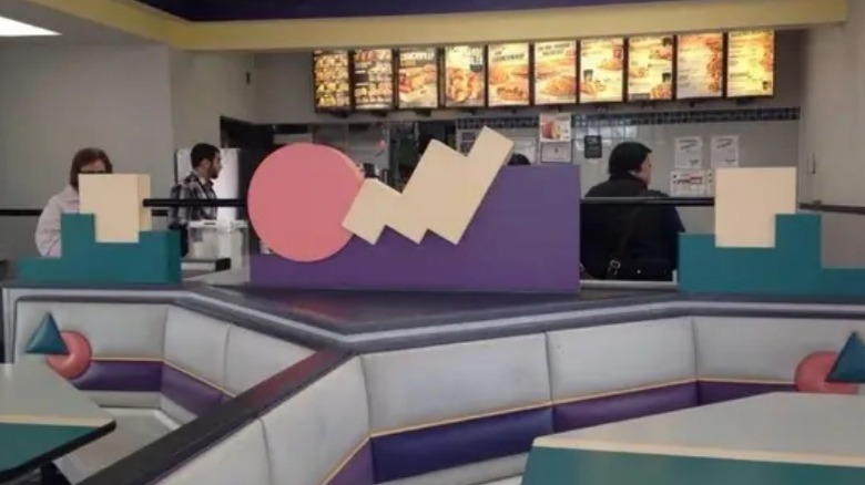
But, like any good design, you can't rely on words alone to fully explain its concept. A perfect example of the bold, energetic style of the '90s is, surprisingly, Taco Bell – or how Taco Bell looked during that time. Reddit user u/OmicronGR posted a collection of photos taken in and around a Taco Bell location sometime in the 1990s to the subreddit r/LivingMas. You'll notice soft pastel colors on both chairs and tables, geometric patterns (a design that takes notes from the classic Memphis Design of the 1980s, according to Design Museum), and the famous "Jazz design" airbrushed on their cups. The menu's design is much more "radical" compared to its modern counterpart — not to mention the lower prices.
While many Redditors found themselves nostalgic, this raises a question — why exactly is such an eye-catching aesthetic scantly seen nowadays? Wouldn't such experimental and "counterculture" designs appeal today?
Modernization and uniformity replaced '90s aesthetic
After you finish looking through the pictures of a Taco Bell from the 1990s, go to your local Taco Bell and take a look inside. Suffice to say, it looks quite different now. Restaurant Business Online reports that, in 2016, Taco Bell began overhauling its restaurants using four different designs, each meant to reflect the setting a location was in. For example, New York and Boston locations would get the "Urban Edge" design, while more coastal locations will get the "California Sol" design.
Taco Bell's overhaul of its locations follows suit with other fast-food chains shedding their bright colors and quirky designs to focus on streamlined and modern interiors. McDonald's, once known for PlayPlaces, bright red and gold colors, and Ronald McDonald, has begun to "modernize" their restaurants through sleek architecture and inoffensive neutral colors like grey or light beige. While this was done to help catch up with changing times, some, per Vox, view these new modern McDonald's as "boring." This same sentiment of current fast food design is shared by Taco Bells via Reddit, who ranted against the "lifeless" and "dull" look that Taco Bell has.
The reason fast food restaurants have that "uniform" style, explains Cheddar, is influenced by fast-casual restaurants, whose clean, modern interiors overtook the zany and colorful designs of fast food. Many restaurants, Taco Bell included, revitalized themselves to appeal to the fast-casual crowd, shedding their own unique styles in the process.