People Are Comparing McDonald's Packaging Redesign To Burger King's
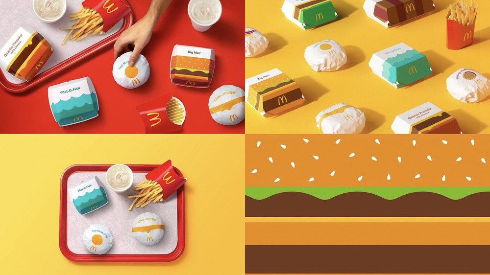
Some things are just too iconic to change, like the classic golden arches that signify to people all over the world a McDonald's is nearby. However, evolution in design and aesthetic preference are inevitable, as evidenced by the brand's brand new product packaging design, set to launch soon worldwide (via DesignBoom). The flat design is bold and each item is easily recognizable, especially the Egg McMuffin and the Filet-O-Fish, which make expert use of minimal colors and shapes to achieve the maximum impact. However, the new look is causing more than a few waves online because it follows a similar rebrand from a competing fast food company.
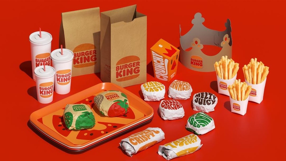
According to Creative Bloq, "Hot off the heels of Burger King's bold, illustration-led rebrand last month, McDonald's has unveiled a redesign of its own — and it's very, well, bold and illustration-led." While distinct from each other, both brands make use of the flat design style and retro influences, making the comparisons easy to understand. However, Burger King went all-in with a custom, psychedelic font inspired by food and a new logo that seems determined to make consumers crave a burger (via Creative Bloq). When it comes to comparing the efficacy of these new packaging designs, the internet had a plethora of opinions.
What people have to say about McDonald's and Burger King's new rebrands
People online were quick to point out that the new McDonald's packaging looks reminiscent of Burger King's recent rebrand, with one person tweeting: "When your biggest competitor just absolutely nailed a fun packaging update you simply have to respond. I really like the simplicity of what has been done here, but Burger King's packaging has the edge – the retro, nostalgic feel makes this new McDonalds range look second choice." Meanwhile, others were just as quick to take the side of McDonald's.
According to one fan of the new design, this refreshed packaging could be effective enough cause a shift in direct-to-customer marketing. He tweeted: "The days of DTC brands differentiating with design and acquiring customers cheaply are numbered. On one end you have incumbent brands stepping up their design/brand identity game. On the other end you have a cookie-less future that will wreck your social media CAC." He went on to say: "McDonald's new packaging looks like... a modern brand. Design is (literally) flattening. Feels like brand incumbent vs DTC disruptor competition has moved on to a new phase" (via Twitter). We'll just have to wait and see if this marks the beginning of a new trend across fast food franchises.