Food Mascots That Are A Lot Older Than You Realized
Throughout history, many popular fast-food brands and common grocery store names have become synonymous with the cute little mascots that seem to keep their marketing efforts afloat. From sassy social media personalities to quotable commercials, food mascots are heavily ingrained into our pop culture more than we consciously realize.
And while Wendy, for example, has found herself so nuanced throughout the years that she has captivated all of Twitter, the social-media comedian dates all the way back to the 1960s. Just like Wendy, many of our favorite mascots have rich histories that are not to be erased from their ever-evolving marketing strategies.
Though some modern-day mascots have been restyled into futuristically lifelike versions of their old two-dimensional selves, others have remained true to their original design through the years. From fast-food icons to brands that we all keep in our cabinets, here are some of our favorite food figures and their historic origins.
Jollibee (1978)
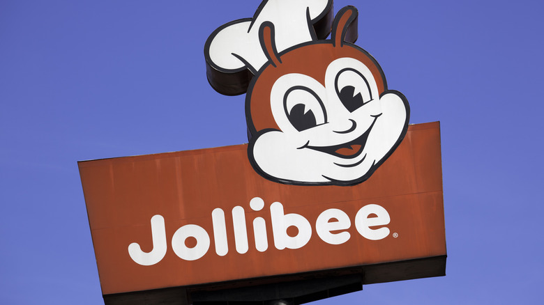
Everyone loves the quintessential jolly bee of the Philippines. Despite his middle age of forty-one, Jollibee still looks just as youthful as ever. He continues to sport his snappy bowtie and an ear-to-ear smile, delighting (and sometimes frightening) his guests as they enjoy their jolly spaghetti and palabok fiesta.
But the good-natured bee hasn't always carried his signature happy-go-lucky look. In fact, when Jollibee founder Tim Caktiong first created the little guy, he looked more like an insect rather than a cheerful cartoon. As his portrayals evolved, though, he soon became the adorable winged friend we all know and love today.
Inspired by his own daughter's drawings, Caktiong wanted to bring a Disneylike nature to his mascot by adding white gloves, a red jacket, and round blushing cheeks. As the bee gained fame and fortune throughout Southeast Asia, (and even his own kid's television show!) soon other nations wanted Jollibee franchises of their own, and thus the mascot made his way to Europe, the United States, and Canada.
If you're wondering what business a bee has in representing a burger and spaghetti chain, you'll be surprised to know that Caktiong elected the jolly bee to serve as his emblem, as the furry insect stands for hard work to achieve a life that's sweet like honey.
Wendy's (1969)
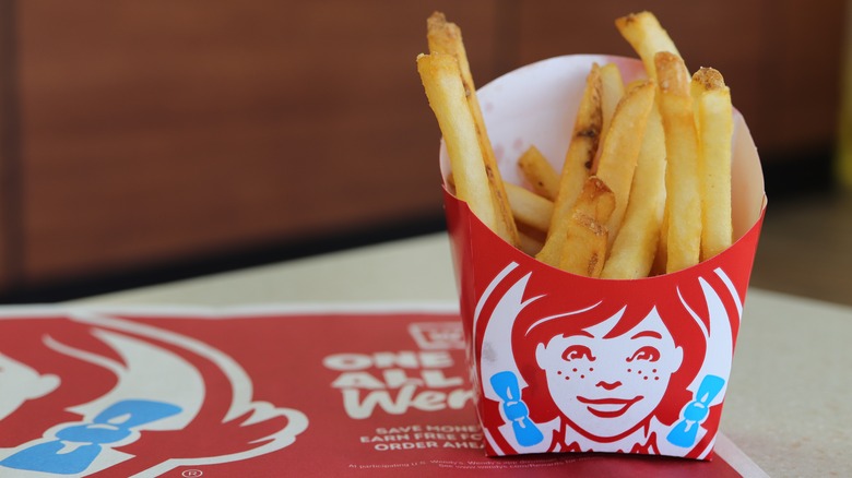
If you've ever wondered if the beautiful red haired girl who represents the burger and fry chain is a real person, we're here to tell you that she is — or rather she was. Inspired by the founder's daughter, Melinda Lou "Wendy" Morse is the name behind the face of the popular franchise.
Her signature red braids adorned with blue bows are quite synonymous with burger-eating, as Wendy's has become the sixth most popular burger joint in the United States since its origin in the late '60s. And while Wendy intended to represent a sweet and polite young woman, her recent social media presence has shown that the girl has developed quite the attitude throughout the years.
"yo @wendys i have zero time for square patties. #pointless," someone tweeted — to which the mascot sardonically replied, "then how come you had time to write this tweet?" In another example, Wendy tweets a photo of a garbage can in response to another user asking for directions to the nearest McDonald's. As the brand has worked to maintain relevance in the modern marketing world, its mascot has humorously moved away from its original Melinda likeness into a spunkier version of herself.
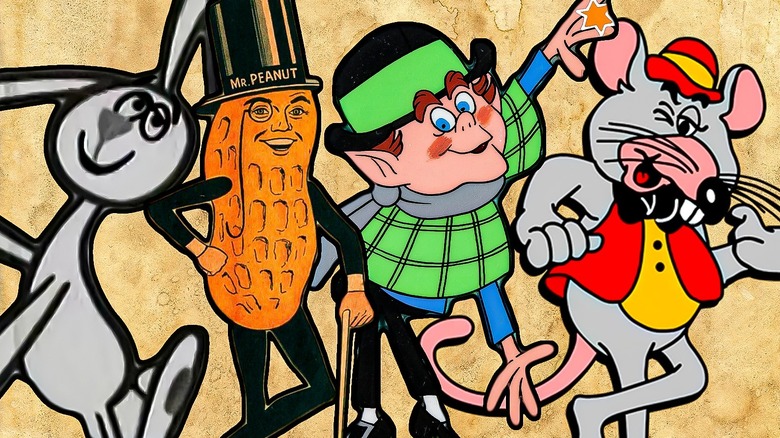
Chuck E. Cheese (1977)
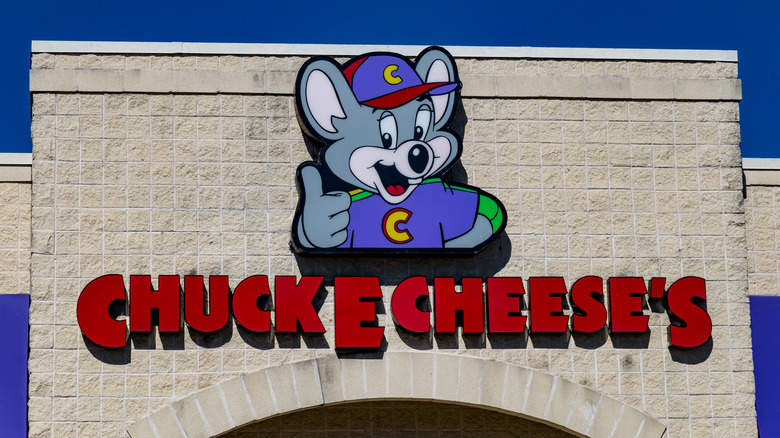
Since the 70's, Charles Entertainment Cheese has been the face of the children's arcade and pizza franchise. But did you know that Chuck has a bit of a dark backstory? Apparently, the poor mouse grew up an orphan. And because he didn't know much about his origins, he was unable to celebrate his birthday each year. He didn't let this get him down, though, as he was determined to give other kids the exciting birthday parties they so deserved. This, as explained by the mouse's creators, is why Chuck E. Cheese's is the ultimate birthday party destination.
Originally designed as "Rick Rat" in the '70s, marketing quickly decided to make some serious changes as they thought patrons might turn their noses up at the presence of a rat near their food. But mice — they decided — were much more positively connotated than their counterparts, and thus Chuck E. Cheese was born.
And while the mouse's modern personality is nothing shy of friendly and welcoming, Chuck went through a brief rebel phase in his origin, as he was often seen smoking cigars in ads. After some modification, the mouse can presently be found sporting his signature toothy smile and a purple shirt with a green "C" right in the middle.
The Gerber Baby (1928)
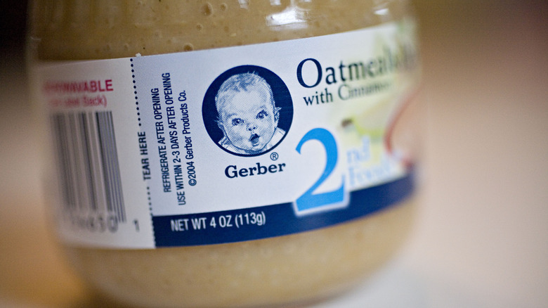
The late 1920s brought about a drawing contest in which Dorothy Hope Smith hoped to design Gerber's first mascot. After submitting her charcoal drawing of a smiling, bright-eyed little baby, she attached a note explaining that she would color the sketch if she was selected as the winner. The judges liked her drawing so much that they didn't ask her to finish it — they wanted to accept it just the way it was!
In 1931, the company officially selected the baby as their beloved spokesmodel. And as she captured the hearts of the public, many wondered about the real-life identity of the infamous Gerber Baby. After much speculation and even a nationwide poll, the identity of the baby was revealed in the late '70s to be mystery writer and former English teacher Ann Turner. This announcement brought about success for the brand, as it established that babies who eat their nutritious formula would grow up to be healthy, attractive members of society. Upon Turner's passing in 2022, Gerber took to social media to express condolences for the friends and family of their original spokesbaby.
Lucky The Leprechaun (1964)
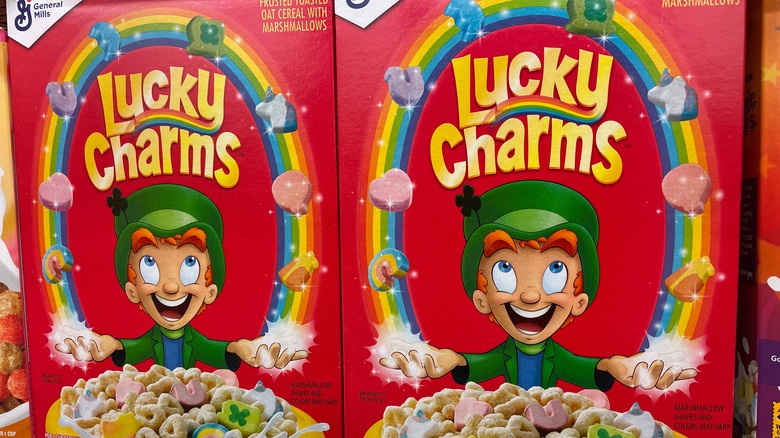
On St. Patrick's Day of 1964, Lucky the Leprechaun made his debut in a color print advertisement for Lucky Charms in the Sunday comics. "'Tis luck to catch a leprechaun!" he said. "'Course if they did — they'd catch my Lucky Charms!"
From his claim to fame via the Sunday comics, people fell in love with the coveted "marbits," (marshmallow bits) that Lucky so closely treasured in all of his ad appearances. And as new marbits entered the Lucky Charms universe, viewers would soon realize that each of the fun marshmallow shapes provide Lucky with special powers — a blue crystal ball in which he could predict your future and a yellow hourglass to help him travel across time and space.
And if that isn't exciting enough, Lucky soon introduced various promotional items that kids everywhere couldn't wait to get their hands on. From a miniature farm to a plush Lucky toy, Lucky Charms' marketing team worked hard to ensure the beloved leprechaun remained at the forefront of pop culture.
While kids aren't necessarily begging their parents for Lucky the Leprechaun merch these days, they are, however, still seeing his smiling face on the beloved cereal box — or perhaps in ads between YouTube videos.
Chef Boyardee (1928)
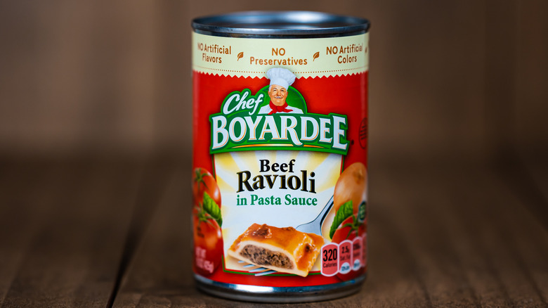
From canned ravioli to jars of sauce, Chef Boyardee is a staple name in many grocery stores all across the US, and his story is one that captures the essence of the American dream to a T.
Upon Ettore (Hector) Boiardi's immigration to Ohio when he was just sixteen, he was determined to bring the flavors of Italy with him. After serving as a supervising caterer at both of 28th U.S. President Woodrow Wilson's weddings, the seasoned chef opened his very own restaurant in which he debuted his prized spaghetti sauce.
Boiardi's sauce, as it turned out, was quite the hit. Entranced by its robust tomato flavors, guests asked the chef to send them home with bottles of it — so he started packing his concoction into milk cartons and selling it by the gallon. Before he knew it, his secret sauce gained more attention than the restaurant itself. Unable to keep up with supply, Boiardi moved his business to Milton, Pennsylvania, and began to market himself as the icon we know and love today.
Changing his name to the phonetic English spelling — Boyardee — he took advantage of the growing glamor that Americans associated with Italian food and focused on creating an accessible exotic cuisine during the Great Depression when most people couldn't afford upscale dining.
While the chef has since sold his company for nearly $6 million, his face still proudly represents the brand — his mustached smile greeting all who seek the flavors of Italy.
Planters' Mr. Peanut (1916)
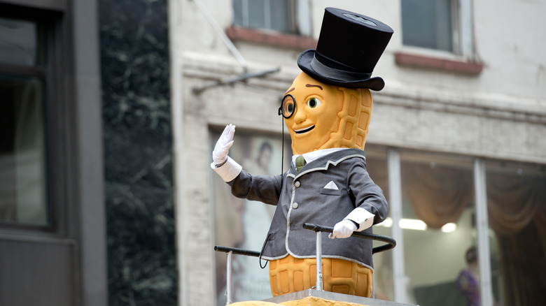
Ah, yes. The late Mr. Peanut. Who can forget the legacy left behind by the elegant, monocle-wearing legume? His heroic sacrifice was plastered all across social media — as often happens in the modern day — making nothing more than a spectacle of his death. It's a shame, really. But among the tragedy of his untimely death, it's important that we instead place our focus on his full life and the path he paved for the popular nut brand.
Mr. Peanut was born by school-aged artist Antonio Gentile as he submitted his sketch to Planters' mascot drawing contest. He quickly became the face of the company, soon plastered all through Times Square in 1937. As Mr. Peanut rose to fame — an appearance at the New York World's Fair and the Macy's Thanksgiving Day Parade, recognition on the Advertising Walk of Fame, and even receiving his own Nutmobile — a select few of those who followed along on his adventures, the Peanut Pals as they were called, dedicated their time to collecting memorabilia featuring the infamous peanut.
Until his final moments when he died in the Super Bowl commercial, Mr. Peanut was perhaps the most acclaimed nut in the advertising world. At 104 years old, he finally met his end. "In the ultimate selfless act," tweeted his estate, "he sacrificed himself to save his friends when they needed him most. Please pay your respects with #RIPeanut."
The Starbucks Siren (1971)
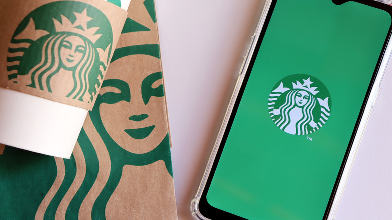
If you're wondering what a mermaid has to do with coffee, you're not alone — so were we. The choice seems a bit random, but seeing her face upon each coffee order, we've grown so accustomed to the siren that we don't think to question this strange marketing decision. According to Starbucks' creative director Steve Murray, her backstory thoroughly explains why such a nautical icon is representing a coffee brand.
As Starbucks' native town of Seattle is a city of many ports, the creators felt strong ties to the aquatic world — not only because of their nautical roots but also because coffee travels far and wide across the seas to arrive at their stores. The name itself takes inspiration from the first mate in Herman Melville's most classic novel, which encouraged the founders to take to a marine-like mascot to represent their product. The siren, they felt, was an excellent choice because she depicts some of their core values.
"[The siren] is about being good to people, being good to the world," says Murray, "I think it's about being good citizens of the planet and taking care of each other in that way and standing up for what we believe in."
Throughout the years, the green siren has gone through quite a few changes, but to this day she remains on our morning cups of coffee.
The Morton Salt Girl (1914)
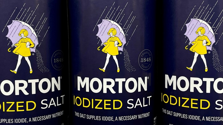
Do you ever wonder why the Morton Salt Girl is holding an umbrella? Well, it's because consumers were so excited about Morton's patented pouring spout that allowed salt to "flow freely," almost like rain showers.
Morton's marketing team felt that a little girl using an umbrella to keep dry would wholly encompass the company's narrative. With this delightful new mascot, though, also came the necessity of a fitting slogan to match. After playing with the concepts of free-flowing and rain, they finally decided on the classic saying: "When it rains, it pours."
This slogan is common in our everyday language, though most people don't know where it comes from. And this clever line, in combination with the famous Salt Girl, is what brought Morton to fame. Now over a century later, she still remains relevant. While her style has been through a few changes, her essence still remains and can be found on the shelves of supermarkets everywhere.
The Vlasic Stork (1974)
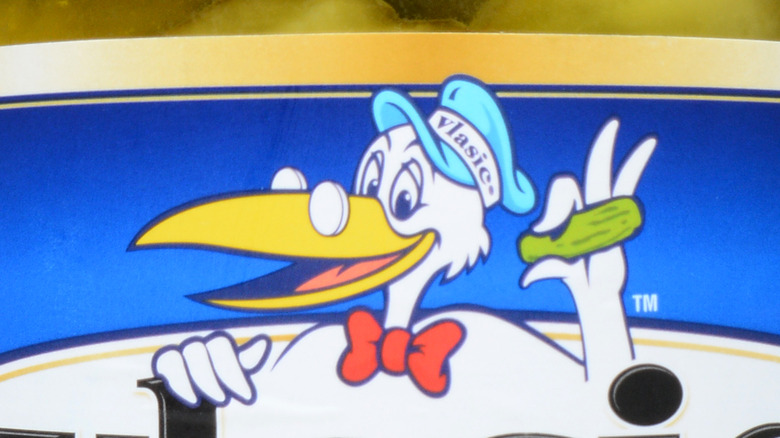
Of all the mascots that seem to have nothing to do with the product or food they represent, the Vlasic Stork has to be at the top of the list. Stick with us, though, and you'll find out why storks and pickles have become so synonymous with each other ever since the '70s, when the pickle brand adopted the loveable character as the heart of its marketing.
The company's story begins in 1912 when Frank Vlasic came to the States — not to sell pickles, but cheese. He established a creamery and then handed it over to his son, Joe, who quickly began selling pickles flavored with dill and an assortment of dairy products. Pickles, as it seemed, were a greater hit than cheese, so Joe turned his newfound company over to his son, Bob, who then worked to create the classic Vlasic Pickle that we know today. But why a stork?
Many wondered this as well. Some speculated that a stork selling pickles makes just about as much sense as a cheesemonger selling pickles. Others suggested that Vlasic was kind enough to employ someone who — due to the dropping birth rate of the time — had no babies to deliver and was fresh out of a job. Whichever theory you believe, serving as the spokestork for a pickle company seems like a great way to get back on your feet after a brief spell of unemployment.
Julius Pringles (1967)
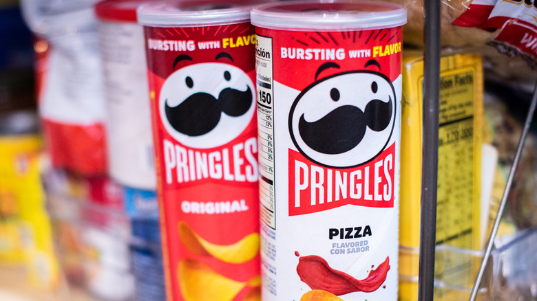
If you look closely, you'll see that mascot Julius Pringles' mustache is really just two Pringle crisps touching one another. This hasn't always been the case, though. In some of his most original drawings as early as 1967, the jolly old man has a regular-looking mustache — not to mention piercing red eyes and no visible smile.
Despite his original depiction as a rather unfriendly old man, he has changed drastically throughout the years. From a more modern hairstyle in 2002 to the addition of a red bowtie to an eyebrow update, Julius' image has evolved to meet marketing demands since his original drawing in the '60s.
While nobody really knows where Julius comes from, it is speculated that his founders, Gene Wolfe, Fred Baur, and Alexander Liepa, created him with an element of secrecy in mind. Recently, though, the public was able to catch a glimpse of the rest of the mysterious mascot's body after British comedian John Oliver offered to donate $100,000 to Feeding America if Pringles would release the rest of their spokesman's stature. The company happily accepted, and now we can finally put a body to the head.
Elsie the Borden Cow (1936)
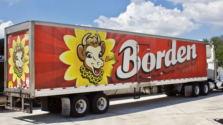
In efforts to encourage a more friendly aura around the selling and consuming of dairy products, Borden began to employ a friendly cow to serve as the face of their company. Starting as amusing ads in medical journals, Elsie began her fame mostly in the doctor's office, as practitioners often hung her comics on the walls. When news commentator Rush Hughes featured her on his radio show, fan mail addressed to the spokescow began pouring in rampantly.
With the help of Elsie, Borden's products quickly grew to fame. Debuting their cutting-edge new cow milker that automatically milks live cows en masse, many were quick to muse not at the new technology, but rather at the cows themselves and which one was Elsie.
It was then in 1939 that Borden selected a real live cow to serve as the company's live mascot. They selected one that was perfect for the job and draped a special green blanket over her back. From then on, she appeared in movies and public outings, proudly representing the dairy brand for years to come. To this day, the company has kept the depiction of Elsie on its packaging. You can find her smiling from ear to ear, adorned with a beautiful necklace of yellow daisies.
The Trix Rabbit (1959)
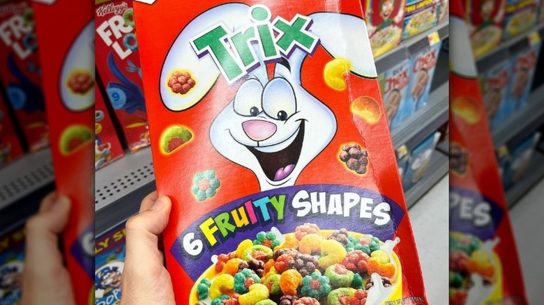
If you've bothered to pay attention to the commercials between your favorite shows, perhaps you have wondered why Trix can't be for rabbits too. While we can speculate that this is because rabbits have no way to pay for the cereal, we never do find out the true reason why Trix is just for kids.
This whole dilemma dates all the way back to the late '50s, upon the rabbit's debut in which he so clearly states his predicament.
"I just love [Trix]," he says. "Silly rabbit," says the little boy, "Trix are for kids." Ever since then, the rabbit has been the spokesbunny of Trix as he tries his very hardest to get his paws on the fruity cereal.
And while he's not allowed to eat it, he can — at the very least — appear on the cover of its box. In 1960, the rabbit became the official face of the brand, his modern cartoonlike depiction replaced by a mere photo of a stuffed rabbit copied onto the box's front.
The year 1965 brought about the addition of Trix memorabilia — scratch and sniff stickers, a rabbit alarm clock, and even a finger spoon for a fun new way to eat your breakfast. While this level of hype around Trix has since simmered down, the rabbit still remains the face of the brand as he tries so desperately to get his hands on the fruity cereal.
The Jolly Green Giant
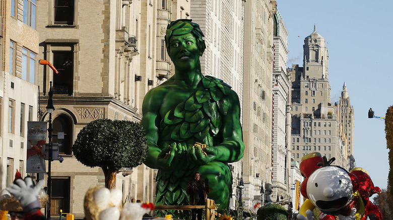
If you've ever driven through Minnesota, you likely understand the excitement of passing the Jolly Green Giant Statue on the side of the road. But did you know that this guy has been around since 1925?
Named after a particularly large type of pea, the Jolly Green Giant didn't start out so jolly. Wanting to show how eating veggies can make you grow big and strong, the earliest depictions of the mascot feature a tough-looking fellow who, if we're being honest, is mostly just scary.
As the brand image shifted from slightly frightening to a more gentle nature, the Jolly Green Giant grew taller and significantly happier throughout the years. His skin turned green and he embraced a more natural look — a getup made from green leaves and even a red scarf in the '80s.
Throughout the years, the giant has dropped the "jolly" from his name, but he is still in good spirits nonetheless, and can be found smiling down at passersby in Blue Earth, Minnesota.