12 Old-School Restaurant Logos We Want To See Again
Logos are a calling card for everyone's favorite restaurants. Take McDonald's 'Golden Arches' or the iconic Starbucks siren, just to name a couple. Without words, these brands' logos (and their corresponding shapes and colors) tell customers everything they need to know. But fast food restaurants used to look so much different, and over time, chains often undergo dramatic changes in an attempt to stay relevant — one example of which is to update their logos.
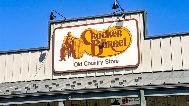
These alterations can be met with open arms or backlash from loyal customers. Some don't mind change as long as the food is the same, while others cling to the logos of the past. Over the summer, Cracker Barrel announced plans to modernize its logo as part of a larger attempt to boost a trend of falling sales. Yet the change was met with extreme ire from customers and even U.S. government officials. As such, the chain is reversing course, and the original logo will remain. Although other brands have more success (and caused less angst) when it comes to changing their logos, there are a number that we wish had stuck with their old-school roots. We've compiled a list of these changes and some of the restaurant logos of days past that we want to see again.
Burger King
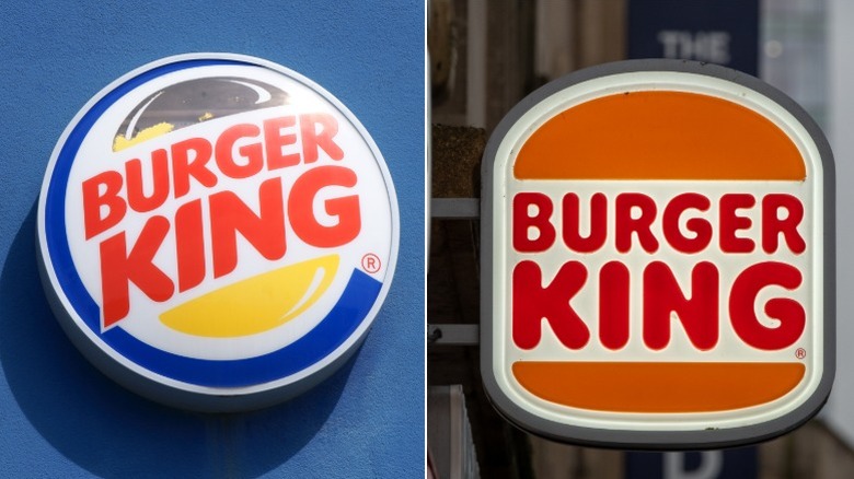
Currently, Burger King's logo reflects its name and offerings — it's literally a burger shape, with the name in the middle representing a patty. This logo is an homage to one of its original designs (which also features the burger shape), but you might be most familiar with the logo introduced in 1999, which was round with a blue swirl around the outside.
Dunkin'
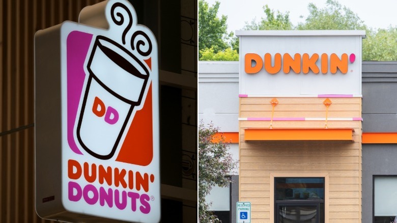
Before it was the sleeker 'Dunkin',' everyone's favorite munchkin provider was Dunkin' Donuts. While the brand has kept the iconic orange and pink color scheme, we definitely miss the immediately recognizable Dunkin' cup featured on the logo introduced in the early 2000s.
Pizza Hut
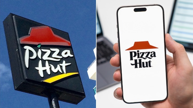
The current (and recently changed) Pizza Hut logo features the chain's name and the phrase 'No One Outpizzas The Hut' under that classic red hut shape in its purest form (which is very geometric). But in the past, the brand was more fluid with its logo, and we especially like the early 2000s version, featuring a more script-like font, more colors, and the impression of movement with the slanted hut.
Taco Bell
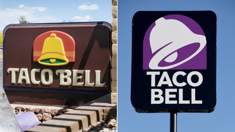
Taco Bell's logo has gone through a number of iterations prior to reaching its current state — the white bell on a purple background. While the real significance of Taco Bell's minimalistic logo has to do with sophistication and versatility, the chain's older logos featured more color and movement, particularly the design introduced in the 1980s that features earth tones that were popular at the time.
Dairy Queen
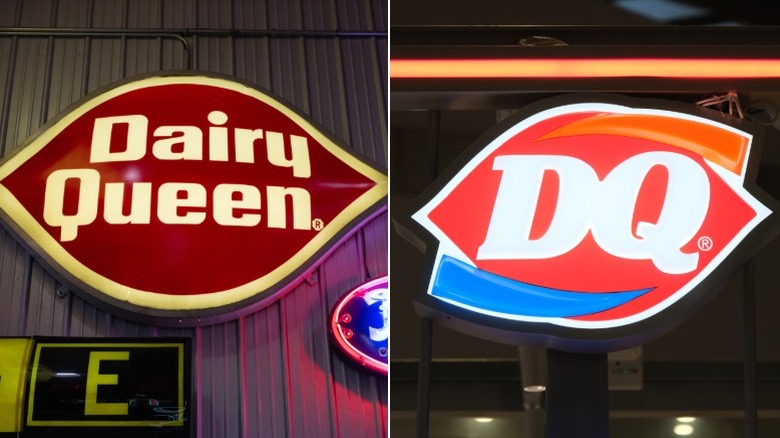
The very first Dairy Queen logo was simple, featuring the chain's name on a blue background. In 1960, the logo transformed to feature a red lip-shaped background. Although the modern logo's colors represent a hidden meaning — gold for food and blue for "treats" — there are times when we long for the simplicity of the early logo (via NRN).
Kentucky Fried Chicken
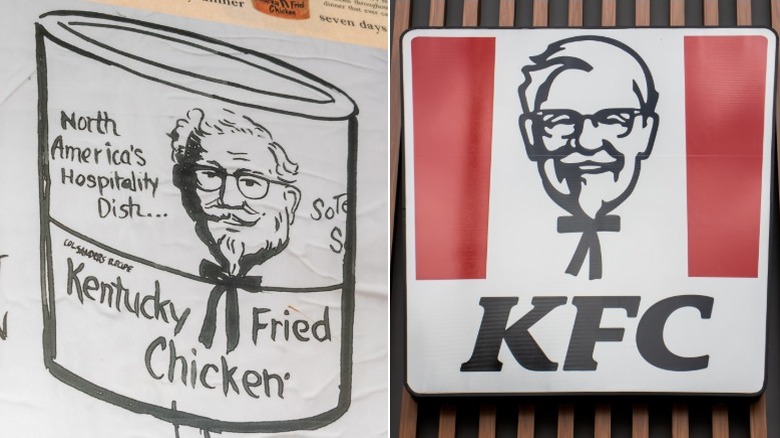
Colonel Sanders has always been a big part of the Kentucky Fried Chicken logo, and now, he appears in a modernized drawing between the classic pops of red. Though modernized, there's something so nostalgic about the original logo, which featured no red, alongside a black and white, less cartoonish drawing of the colonel.
Starbucks
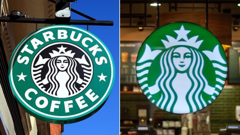
Like KFC, the Starbucks logo has featured the siren figure since its inception in 1971. In 1982, the siren, as we now know her, appeared with the words 'Starbucks Coffee' around her. The most recent logo (introduced in 2011) features the green siren with no words, but we can also appreciate the design that stood the test of time for 40 years.
Auntie Anne's
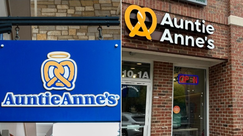
Auntie Anne's is a staple shopping mall snack, and the pretzel has long been part of the brand's logo. In 2025, the chain decided to rebrand with a "sleeker" design that is geared toward younger generations, but still features a pretzel (via Restaurant Dive). Although the new logo is more simplified, the old-school pretzel topped with a halo will remain in our hearts.
Jack in the Box
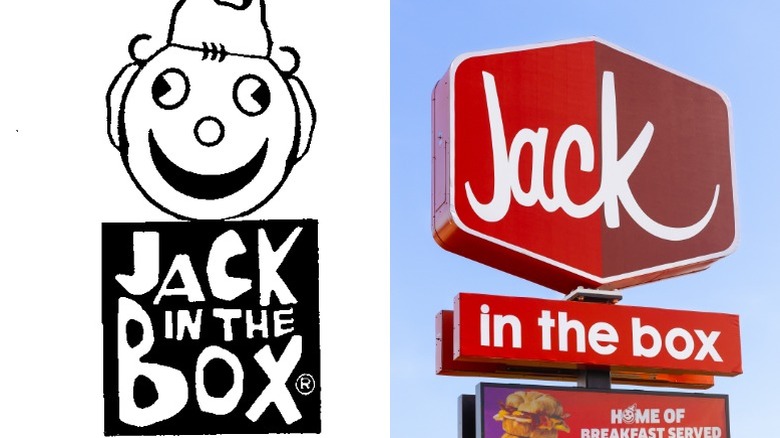
San Diego-based burger joint Jack in the Box has always featured its namesake box in its logo in some form. Currently, the box is simple and red, yet in the chain's early days in the 1960s and '70s, the logo was more literally inspired by a jack-in-the-box toy, featuring a clown face popping out of the box.
Baskin Robbins
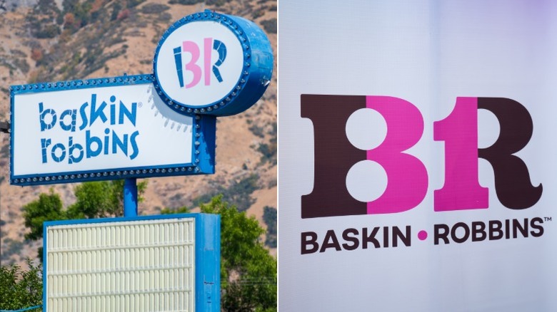
In an attempt to modernize its brand and appeal to younger customers, Baskin-Robbins revamped its logo in 2022. Gone are the days of pink and blue name surrounding the number 31 and the revamped "BR" in its comic-heavy font; in its place, a more modern and geometric version. Yet the chain still calls back to its hallmark 31 Baskin-Robbins flavors (one for each day of the month) with a 'hidden' 31 between the B and the R in both the old and new logos.
Olive Garden
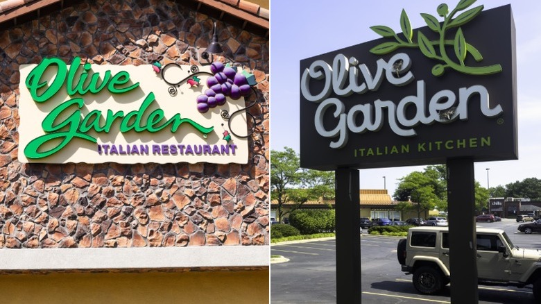
If you spent your childhood going to Olive Garden with your parents, you probably remember the Italy-inspired logo — complete with a swirly script font and a bunch of purple grapes. Making our list of the chain restaurant makeovers that didn't sit right with customers, in 2014, it updated the logo, removing the grapes and the more stereotypical Italian villa influences in favor of a more muted color palette. At the time of the change, one customer said that the new logo, "look[s] like it was drawn with a breadstick," so although it's been a decade, we're sure patrons would love to see the original logo make a comeback (via Business Insider).
TGI Friday's
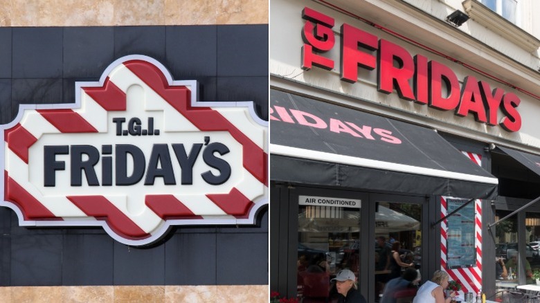
Like Olive Garden, TGI Friday's is another fast-casual spot that attempted to rebrand. The chain completely ditched the iconic red stripes and art-deco-inspired border of its old logo, in favor of a new one that's less flashy (and admittedly, less interesting).