Food Rebrands That Failed Miserably

We may receive a commission on purchases made from links.
Branding creates a distinct identity for businesses, enabling consumers to recognize and connect with products. A well-defined brand helps customers understand what a particular product stands for and what they can expect after their purchase. As such, it comes as no surprise that many individuals develop emotional connections with branding, which significantly impact their purchasing choices.
Whether it's a new logo, slogan, or packaging, rebranding is like a secret weapon for companies to keep up with the ever-changing market. It helps them stay relevant by adjusting to what customers want and how their preferences are evolving. It can also be a tool for damage control. After all, who could forget Domino's successful — if self-deprecating — campaign that acknowledged the company's previous shortcomings and committed to delivering a better product?
While many rebranding efforts succeed in revitalizing a company's image and boosting its market presence, others simply fail to resonate with the target audience. Over the years, even industry giants such as Coca-Cola and Kraft have encountered challenges with their rebranding initiatives. Keen to discover more about some of the biggest rebranding mishaps in history? Keep reading!
1. New Coke
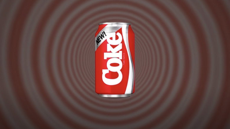
With over 43% of the carbonated soft drink market share in the States, Coca-Cola has earned its place as one of the most globally recognized brands (via Cascade). However, even as an iconic brand, Coca-Cola isn't immune from occasional missteps. Perhaps one of Coca-Cola's biggest blunders happened in 1985 when the company decided to change its popular recipe.
To say that things didn't go according to plan after the release of New Coke would be a massive understatement. A poll conducted at the time revealed that only 13% of soft drink consumers liked the new product, as reported by CBS News. New groups, such as the Old Cola Drinkers of America — even formed to campaign for the return of the original version of the product. Headed by retired businessman, Gay Mullins, the group organized petitions and was generally very vocal about their mission in the media.
Eventually, Coca-Cola had to give in. On July 11, 1985 — only 79 days after New Coke hit the market — the company announced that it would be bringing back the older version of its product. The two soft drinks — New Coke and Coca-Cola Classic — coexisted for a short period of time, before the newer product was rebranded as Coke II and later pulled off the market.
2. Tropicana packaging redesign
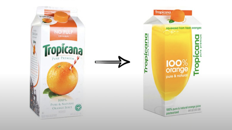
The 2009 packaging redesign of Tropicana resulted in a staggering $30 million revenue loss for the fruit juice brand. When the company launched the spruced-up packaging for its Tropicana Pure Premium orange juice in January, its revenue totaled a whopping $700 million per year. Within just two months, this number dropped by 20%. Plus, it cost the brand a hefty $50 million to restore the original packaging. Not to mention, the $35 million Tropicana spent on advertising its product's new look and catchphrase, "Squeeze, it's a natural."
Tropicana Pure Premium's new packaging replaced the orange and straw with a more streamlined glass of orange juice. It also turned the carton's traditional cap into half an orange to let consumers feel like they were actually squeezing the fruit as they opened the packaging. Finally, the rebranding attempt displayed the brand's name vertically rather than horizontally and in a different font. Unfortunately, by doing so, Tropicana removed the unique characteristics of its brand — the brand logo and the distinctive orange and straw. While some consumers said that the new design was ugly, others failed to recognize the product altogether.
3. Pepsi logo redesign
Since its inception, Pepsi has changed its logo more times than a chameleon changes its colors, with the latest facelift announced in March 2023. However, the company's most controversial rebranding took place in 2008 when it tweaked its iconic Pepsi globe. The modification involved a shift from symmetrical to asymmetrical waves and the removal of the word "Pepsi" from the sphere. The move met with a mixed reception, with some consumers referring to it as "cheap, simple, lazy and soulless" (as per Tailor Brands).
The world first got a glimpse of Pepsi's new visual identity through a leaked project blueprint entitled "BREATHTAKING Design Strategy," which mentioned such abstract — and ludicrous — concepts as the Pepsi planet, the Pepsi galaxy, and the Pepsi energy fields. Perhaps one Reddit user describes the prospectus best, saying, "[The] Pepsi logo redesign brand manual from 2008 is the most hysterical professional document I've ever seen."
Despite the backlash, Pepsi remained steadfast in its commitment to the logo — only tweaking it slightly in 2014 — for many years. However, on March 28, 2023, the conglomerate announced that it will be changing its branding yet again. And for a good reason. In tests where individuals were prompted to recreate the Pepsi logo from memory, the common outcome resembled the '90s version of the design: a circle with the word "Pepsi" inside. In line with this, the new logo will feature straight waves and the word "Pepsi" in upper-case back in the middle of the Pepsi globe.
4. Heinz EZ Squirt Ketchup
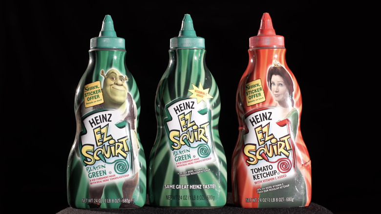
Marketing fads often lack the staying power necessary for long-term success. They may create temporary interest and excitement, but without a solid foundation and a clear strategy, they usually leave businesses scrambling to find the next new thing. This is precisely what happened with Heinz's EZ Squirt Ketchup. Released in 2000, the artificially-colored condiment came in squeeze bottles that let users squirt it into different shapes on their hot dogs and burgers. The concoction was initially rolled out in "Blastin Green" to celebrate the release of the movie "Shrek," with pink, purple, teal, orange, and blue versions following suit.
While EZ Squirt Ketchup initially captured the attention of fast food enthusiasts, selling over 25 million bottles in three years, the artificially-colored ketchup had no lasting power. By the beginning of 2006, the novelty product started being phased out due to a lack of interest. According to Medium, aside from the novelty wearing off, there were two main reasons for this failure: the artificial coloring changed the ketchup's flavor and parents were suspicious about the chemicals that were being added to the condiment.
5. Crystal Pepsi
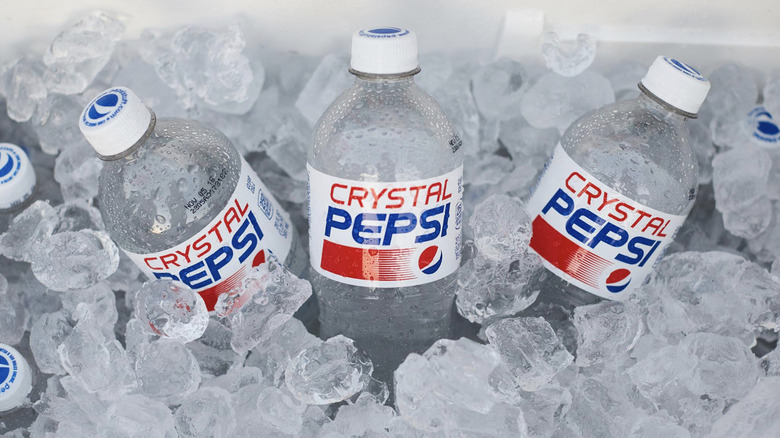
Rolled out in 1992, Crystal Pepsi was marketed as a healthier alternative to traditional colas. Departing from the brown hue associated with its counterparts, the clear beverage was also marketed as caffeine-free and more "pure" than the original product. After the initial novelty wore off, the product failed to resonate with consumers and was dropped by late 1993.
Ironically, it's precisely what made Crystal Pepsi stand out from the pack that was also its downfall. The beverage lacked the distinct caramel color that has been associated with colas for over a century. It also didn't taste like Pepsi, as highlighted by the former COO of PepsiCo who masterminded the product, David Novak (via Business Insider): "The bottlers told me, 'David, it's a great idea, and we think we can make it great, but it needs to taste more like Pepsi. And I didn't want to hear it." Finally, it probably didn't help that Crystal Pepsi was pricier than the classic version of the drink.
Despite its failure, Crystal Pepsi made a number of limited-time comebacks, standing testament to the fact that even a failed product can evoke a sense of nostalgia in consumers. Crystal Pepsi was also re-released in 2022 to celebrate the soft drink's 30th anniversary. While the beverage wasn't available at grocery stores, fans could win a batch of the colorless drink by sharing a photo of themselves taken in the 1990s on Twitter with the hashtags #ShowUsYour90s and #PepsiSweepstakes.
6. McDonald's McPizza
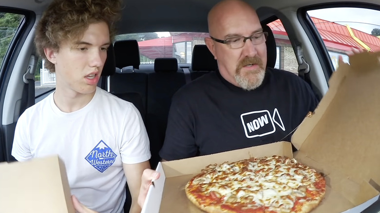
McDonald's is known for its burgers and fries, but back in the late 1980s and early 1990s the fast food chain ventured into uncharted territory with the introduction of the McPizza. Unlike the chain's traditional on-the-go offerings, McPizza represented a departure from its usual quick-service model. More specifically, it aimed to compete with traditional pizza chains by offering made-to-order pies with a variety of toppings.
Despite the good intentions, McPizza failed to gain traction and was eventually phased out, serving as a reminder that even a powerhouse like McDonald's can face setbacks when straying too far from its core menu. The main issue with the fast food offering was the fact that it wasn't exactly fast food — at least, not in the McDonald's sense of the word. The pizza took 11 minutes to prepare, which apparently was too long for McDonald's customers who were accustomed to quick service.
Notably, two McDonald's outlets in the U.S. — one in Pomeroy, Ohio, and one in Spencer, West Virginia — continued to serve the menu item until 2017 when the chain's corporate division stopped the practice. Today, there's just one McDonald's location that continues to dish out pizza, as well as pasta and waffles. Located in Orlando, Florida, this particular outlet also stands out as the largest McDonald's in the world, boasting an expansive 19,000 square feet.
7. Pizza Hut's Pasta Hut campaign
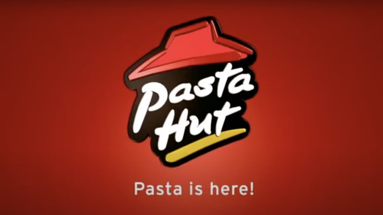
Many of us will never forget the time Pizza Hut in the U.K. made the ill-fated decision to announce that it was morphing into Pasta Hut. The 2008 attempt to expand its branding beyond the chain's pizza left a lasting impression, albeit for the wrong reasons. While Pizza Hut had established itself as a go-to destination for pizza lovers, its foray into pasta — and a so-called healthier menu — left its customers nothing short of confused. Ultimately, only 10 restaurants in London ended up being temporarily rebranded to align with the campaign.
As highlighted by CBS News, the identity transformation met one huge problem: Pizza Hut is all about pizza. And losing this association with the chain's brand was asking for trouble. The purported rebranding to Pasta Hut created a dissonance that left many scratching their heads about the identity of the brand's core product. In the end, Pizza Hut executives admitted that the name change was nothing but a PR stunt — apparently one that didn't have the desired effect. Earlier that year, Pizza Hut released advertising in the U.S. proclaiming that the chain was rebranding as Pasta Hut to promote its new Tuscani range of pasta — apparently also a media stunt.
8. Kraft's iSnack 2.0
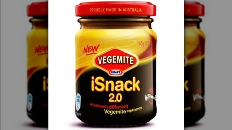
In 2009, Kraft's Vegemite, a beloved savory condiment in Australia, stepped over an invisible line when it proposed to name its new, creamier version of the snack iSnack 2.0. In an effort to engage consumers in its product marketing strategy, the company sought name suggestions from the public temporarily labeling the spread "name me." After close to 50,000 suggestions from consumers, Kraft opted for the somewhat controversial choice of "iSnack 2.0," disregarding the most popular suggestion, "Cheesymite."
The name "iSnack 2.0" was supposed to reflect certain aspects of the product. The inclusion of the letter "i" aimed to signify individual choice. The word "snack," was meant to emphasize that the spread could be enjoyed at any time of the day, rather than just breakfast when Vegemite is often consumed. Lastly, the addition of "2.0" sought to highlight that this product was an updated version of the original Vegemite.
It didn't take long for consumer discontent to surface, with unhappy Vegemites taking to social media to vent their frustration with the new name. According to The Branding Journal, the name "iSnack 2.0" sounded overly modern and technical, failing to strike a chord with consumers. Within just 24 hours of the announcement, "iSnack 2.0" went viral, triggering a flood of negative online comments. The public outcry caused Kraft to reconsider the name change. After conducting an online poll to gather public opinion, the name was ultimately changed to "Cheesybite."
9. Hershey's logo redesign
Made with a 120-year-old recipe, Hershey's chocolate is known for its rich, creamy taste, and smooth texture. In 2014, the brand caused a stir when it changed its logo from a 3D to a 2D design. And while the transition itself wasn't an issue, it was the 2D take on the shape of its Kisses chocolate candy that many found problematic. To cut a long story short, the new interpretation of the chocolate treat garnered attention for its resemblance to, well, the poo emoji.
The criticism was immediate, with netizens hitting social media to point out the obvious. One Twitter user wrote, "On second thought, the new Hershey Kiss logo *does* kinda look like a steaming pile of.." Another user reiterated the sentiment, saying, "Hershey's hires a design firm to design a brand new steaming pile of poo." While Hershey has stuck with the contentious logo, almost a decade later people are still making fun of the design's questionable aesthetics. For instance, in 2022, TikTok logo guru Zachary Winterton called it "one of the weirdest logo redesigns of all time."
10. Coca-Cola's OK Soda
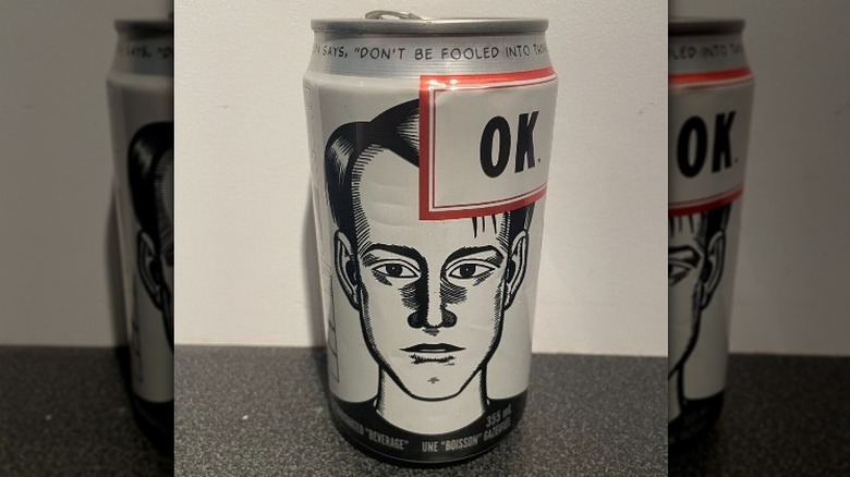
Sandwiched between Baby Boomers and Millennials, Generation X often approaches life with a cynical and jaded outlook. This disillusionment is precisely what Coca-Cola tried to capitalize on with its OK Soda. Launched in a number of U.S. cities in 1993 with the catchphrase, "Things are going to be OK," the citrusy and spicy soft drink promised just that — an OK experience. Notably, as reported by Saveur, the ad agency behind the product came up with the name for the beverage to capitalize on the idea that "OK" was the most recognizable word in the world, after Coke.
Seemingly not learning from its mistakes, Coca-Cola's OK Soda campaign was run by Sergio Zyman, the marketing mastermind behind the company's 1985 New Coke fiasco. The company's intentionally nihilistic and lackluster marketing strategy went as far as promoting the drink's flavor as akin to "carbonated tree sap." Perhaps unsurprisingly, the strategy was a massive fail, with OK Soda receiving a lukewarm reception and ultimately disappearing from grocery store shelves in 1995.
Daniel Clowes, a popular underground artist who was hired by Coca-Cola to come up with the edgy designs on the drink's cans, sums up why the OK-ish campaign may have failed (via MeTV): "I knew full well that what they were trying to do was not possible, that you could not market to cynical hipsters by being cynical and hipsterish."
11. Kraft Foods logo redesign
In 2009, Kraft Food came up with a new logo for its corporate brand in an attempt to differentiate it from the Kraft Food logo. While Kraft's company logo at the time was very straightforward — the word "Kraft" encased in an oblong red shape — the new corporate branding combined many different colors and elements. The new design consisted of the words "Kraft Foods" written in two different lowercase typefaces with the slogan "Make today delicious" written underneath. Furthermore, the word food was underlined with a red line meant to symbolize a smile, ending in a burst of firework-type splashes of color.
The company's new corporate branding didn't go down well. It seems that Kraft executives didn't realize that stuffing too many elements into a logo would create visual chaos, making it difficult to remember. One commentator on Under Consideration criticized the facelift, saying, "An extremely poor update for such an established brand. ... Smiles are barely defendable conceptual devices." They added, "Although there is an attempt at a flower, the combination is poorly executed and just looks naive."
It took a mere five months for Kraft to give in and tweak the design, streamlining both the fonts and colors. In 2012, the company rolled out another new corporate logo that pretty much reverted to its pre-2009 branding with minor changes.
12. Seattle's Best's new logo
The coffee brand Seattle's Best has undergone three name changes since it first started as Stewart Brothers' Wet Whisker in 1970. Today a subsidiary of Nestle, the company morphed into Stewart Brothers Coffee before being renamed Seattle's Best Coffee in the early '90s. More than a decade later, in 2010, the company opted to update its logo from a vintage style to a more modern design in a rebranding decision that many say missed the mark. Notably, this transformation was instigated by Starbucks, the company that had acquired the brand for a cool $72 million in 2003 before eventually selling it to Nestle in 2022.
Some of the criticism leveled at the new red and gray branding was that it bore a resemblance to a blood bank logo or even a peculiar combination of a smiley face and a tongue. An online poll indicates that coffee enthusiasts tend to agree, with 73% saying that they aren't down with the change. One poll voter said the new design looks flat, adding, "The old label conveys longevity, richness of character and boldness. [...] The new logo looks like a universal sign in an overseas airport (give blood here). Coffee is to be savored which the old label conveys."
13. Frito-Lay's Sun Chips compostable bags
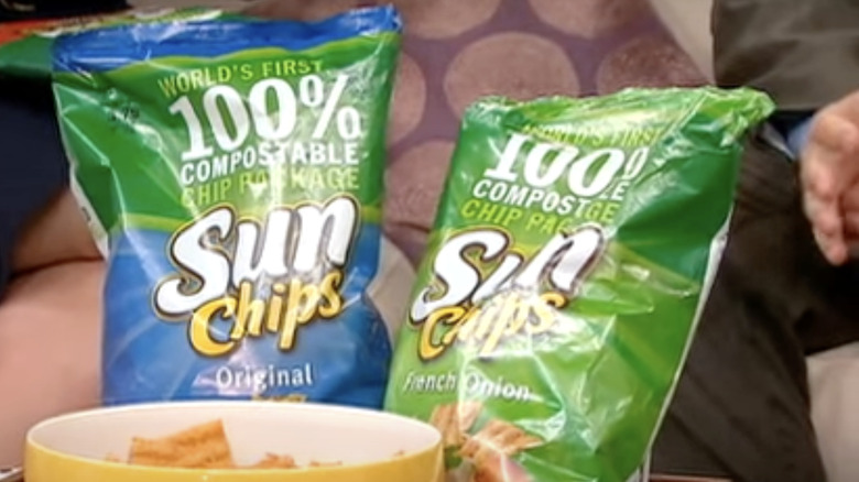
When it comes to marketing and rebranding, sometimes good intentions alone aren't enough. This was the case for Frito-Lay's Sun Chips compostable bags, which were first released in 2008. It didn't take long for Frito-Lay to realize that despite its eco-friendly nature, the packaging had a significant issue: It was noisy. And by noisy, we mean excessively noisy. According to The Takeout, the crinkling sound created by the bags reached "potentially damaging" 95 decibels. The loudness of the bags even led to the creation of a Facebook group called "Sorry But I Can't Hear You Over This SunChips Bag."
The complaints about the noise generated by the packaging and the negative media reception caused SunChips sales to drop by 11% in 52 weeks. Due to the significant decline in revenue, Frito-Lay made the decision to discontinue the compostable packaging for five out of the six SunChips flavors (the Original flavor wasn't affected). Despite the challenges, Frito-Lay persevered, coming up with a new — less noisy — biodegradable packing in 2011.