14 Restaurant Logos With Hidden Meanings
An effective logo identifies a restaurant's brand in a way that's easy to recognize; think McDonald's golden arches, Wendy's red-haired moppet, or Arby's 10-gallon hat. But a superior logo does all that while working in a hidden meaning that signifies something special about a company's ethos or history. These layers may not register at first, but discovering the images' greater significance is like finding extra fries in the bottom of the bag. And who doesn't love a bonus like that?
This doesn't mean the logo becomes overly-complicated or cluttered with these extra aspects worked in. In fact, creating a logo that works on all levels requires distilling the image down to its purest form — including any secret elements with hidden meanings. Some old-school restaurant logos we'd like to see come back were actually reconfigured or replaced entirely to add more significance to the design. There may be significance behind the minimalistic Taco Bell logo, for example, but its meaning is literal, unlike Pizza Hut's cheeky red roof and Dairy Queen's happy stylized mouth.
You've likely seen restaurant logos with hidden meanings in some of your favorite establishments, maybe without even realizing what was concealed beneath the basic design. Some of the best-known restaurant logos in the biz have hidden meanings just waiting to be discovered by the public, from the sneaky arrows and colors that guide the Subway text to the seemingly innocent "LC" design on Little Caesar's toga.
Wendy's
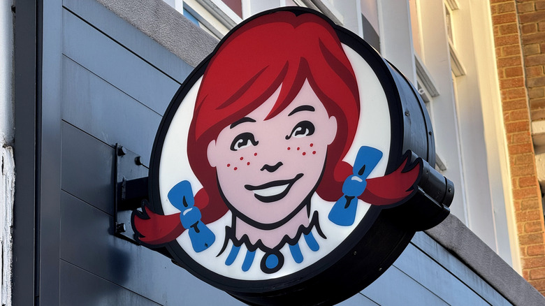
One of the more celebrated restaurant logos with a hidden meaning is the Wendy's logo. After a clean-up in 2012 to modernize the previous logo, which had been in place since 1983, eagle eyed viewers noticed something different about Wendy's collar. The zigzag that formed the ruffle and the cameo necklace at the center also appeared to be a stylized take on the word "mom" as a tribute to the homey beginnings of an American classic. It's a natural fit for a logo that gives vintage vibes from a bygone era.
But the company swears it wasn't intentional, just a happy accident, which adds to the folklore of the fast-food outlet that serves square burgers on round buns. The detail becomes especially clear when the logo is reduced to a single color, making it difficult to miss. Whether it was wild luck, clever design, or a bit of both, it's now an indelible hidden message that Wendy's fans were excited to find, no matter what the bigwigs tell us.
Baskin-Robbins
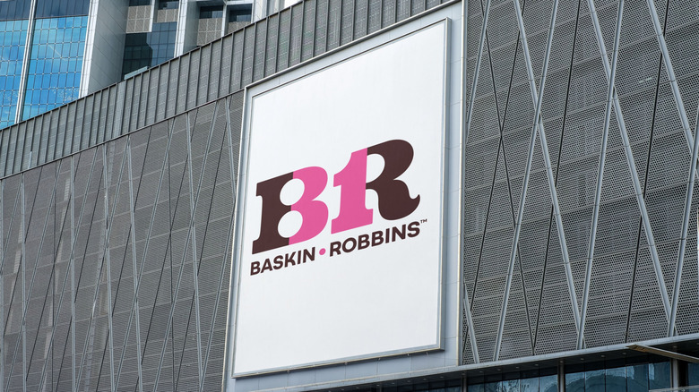
When a restaurant works up a logo as clever and concise as Baskin-Robbins, it rewrites the rules of meaningful design. The playful initial-based typeface, which was launched in 2022, uses an earthy brown and bubblegum pink palette to tie in with the company's trademark spoons and cups. The color separation within the letter forms alert you to the possibility of something significant hidden in plain sight.
Then, your brain separates the shapes by color and the concealed image becomes crystal clear: the pink double bump in the "B" and linear back of the "R" also form a 31 — the famous number of flavors the scoop shop keeps on hand. It's an echo of the same design used in the logo's former incarnation, kept between the names as the previous logo introduced in 1991.
The hidden numbers aren't a new twist, though. The modern Baskin-Robbins logo is an update of the more whimsical blue and pink version that launched the company's hidden meaning Easter egg back in 2006, which some locations still use. It's one of those "once you see it, you can't unsee it" moments for everyone once they recognize it.
Burger King
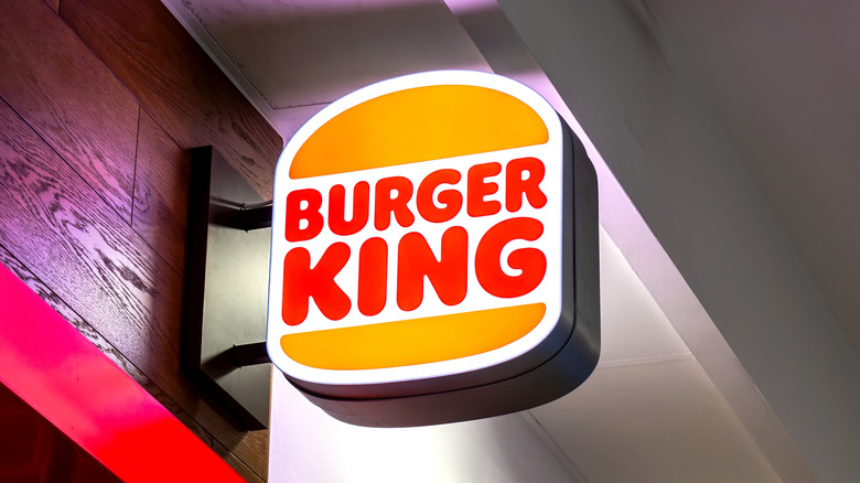
The hidden meaning in the current Burger King logo is more conspicuous than it might seem at first glance. The gold crescents above and below the restaurant's name represent the top and bottom bun of a burger. It takes a little more imagination stretching before you perceive the words "Burger King" in red as two rare patties held within the bun; the entire logo is actually a makeshift double Whopper, an upsell of the company's quintessential creation.
The concept has evolved through the years, but the basic idea has remained intact. It was more obvious in older versions, where the image was less tilted and the bun took on a more apparent shape. The company introduced a new logo in 2021, once again adopting this straight rather than diagonal style. The Burger King website and Facebook account use the latest retro-style logo, as do many of the restaurant signs, making it even easier for customers to spot the hidden burger-and-bun message.
Whichever take on the logo is prevalent near you, the burger-and-bun design gives the company a compact shorthand version of its key product. It's also flexible enough for restyling without losing the core meaning.
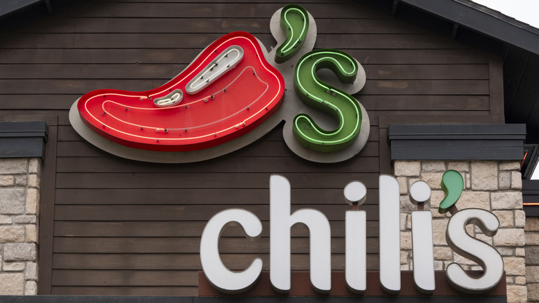
Chili's
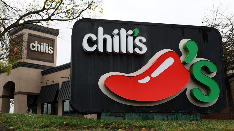
Chili's has been pretty masterful at incorporating hidden meanings into its logos through the years. Choosing a name with such clear visual representation gave the company an advantage when deciding on how to capture the heart and soul of the business.
The most prevalent version these days uses a red chili pepper as the entire logo, with a green apostrophe in place of the pepper stem. A green "S" that resembles a tendril curling off of the plant completes the rebus-style emblem in a smart and purposeful way.
If you have a location that still uses the older sign, you may see only the name used instead of the pepper logo. But look closely and you'll see a tiny chili pepper standing in for the apostrophe. It's a small but essential detail that charms the viewer whenever they realize what they're looking at. It's also a second chance to incorporate a cute chili pepper into the design.
Subway
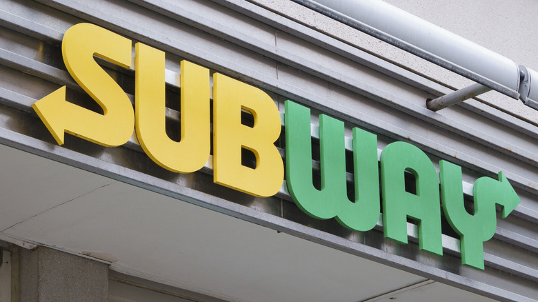
Subway's logo might appear to be just a colorful way to write the restaurant name. But it's also a simplified map that explains in the most basic terms how the sandwich making process flows from start to finish.
In the text-based logo, the arrow at the bottom of the "S" shows where customers start in the sandwich-making line, while the arrow at the top of the "Y" shows where they proceed when their order is finished. Both arrows point in opposite directions, but if you follow the direction of the letters, you get a zigzag map highlighting your path through all the sandwich options waiting behind the counter.
Driving home the idea of traffic flow even further, the "Sub" portion of the logo is rendered in yellow, similar to a traffic light, slowly flowing at the beginning of the line — while the "way" is rendered in "go" green, a nod to the speed of the process after you reach the cash register. Some iterations use yellow and white, but the directional flow of the arrows is the same in both.
IHOP
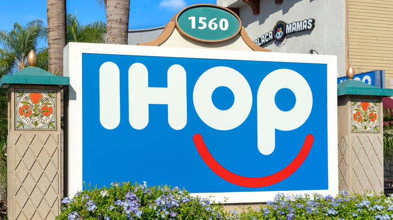
Hearty plates equal happy faces at IHOP, a message the restaurant chain was eager to promote as part of its logo restructuring in 2015. The new image added a colorful burst of happiness to the signs and the menus at restaurants everywhere. The red, white, and blue palette may be a heavy-handed reference to the colors of the U.S. flag, but for an American company that's been in business for almost 70 years, the choice makes sense.
In the new name-based logo, the overly circular "O" and the loop in the "P" form stylized eyes, with a red arc underlining them to form a smile. It doesn't take much shifting of your vision to see the cheerful image reminding you that choosing IHOP is likely to result in an enjoyable experience.
Is the company celebrating customers who already been overjoyed with their short stacks and bacon slices, or are they programming you for your next visit with a logo that essentially tells you how you should feel? There's no reason it can't serve two purposes at once. The best logo designs usually do.
Jack in the Box
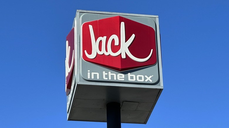
Older Jack-in-the-Box logos were more overt with their symbolism. The company used either the name or Jack's cartoon head positioned in a red square. But the current version of the logo is a bit more stylish, playing coy with its hidden meaning. It also makes this fast food restaurant sign look sophisticated compared to many of its competitors, a stylish touch worked into the rise, fall, and resurgence of Jack in the Box.
You've surely seen the logo where the word "Jack," rendered in a loose typeface that looks almost hand-drawn, sits in a modified horizontal two-tone diamond shape that takes the form of an old-fashioned marquee sign. But if you shift your thinking, you'll see it's also a red box viewed from the edge, with one side in light and one side in shadow. It's a multi-dimensional reimagining of the simple red square featured in the older Jack in the Box logos, keeping the original elements intact but giving them a fresher look.
Olive Garden
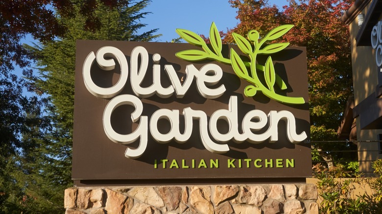
Remember when the Olive Garden logo used grapes and grapevine as part of the design? What was up with that? Sure, it gave the company and its culinary character a distinctly Mediterranean sensibility, but why not use an olive branch with olives as a representation of a company that literally has the word "olive" in the name? The chain finally came to its senses in 2014 and produced an updated logo where olives are the main feature, beyond the stylized restaurant name.
But even the typeface used in the logo now delivers something of a hidden meaning that reinforces the olive motif. The plump "O" in the word "Olive" now resembles a juicy olive itself, and the curlicue swash at the top creates the divot. It seems like a missed opportunity that this highly obvious tie-in was neglected for so long. While many chain restaurant makeovers don't sit right with customers, Olive Garden at least has all of its olives in a row now.
Arby's
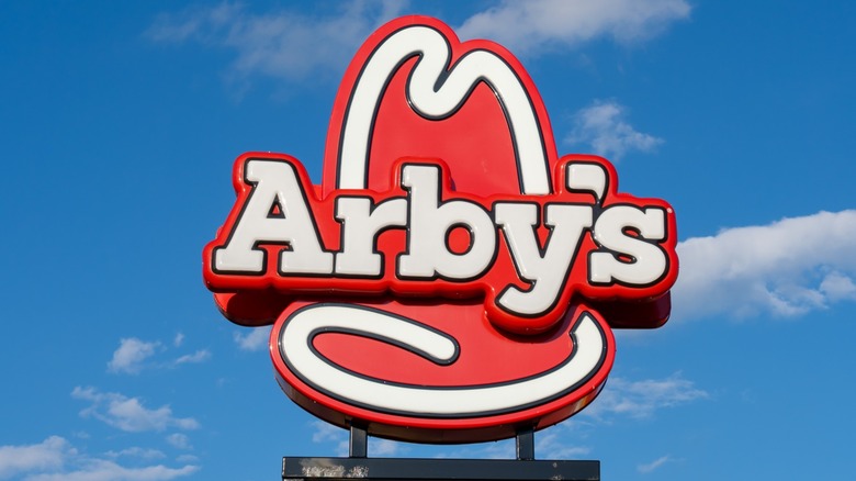
There are more layers to the Arby's name and cowboy hat logo than there are in the sliced roast beef piled onto one of the chain's sandwiches. If you trek back through the company history, you'll find all kinds of hidden meanings and fortuitous connections that make the branding for this timeless restaurant feel like the perfect combination of verbal and visual playfulness.
The most familiar meaning behind the name itself, Arby's, is that each letter stands for a word in the slogan, "America's Roast Beef, Yes Sir." That may seem too direct a hit for a restaurant that serves roast beef sandwiches, as is the phonetic sound of the name, which sounds like "RBs" — an abbreviation of roast beef, another spot-on layer in a logo filled with meaning.
But even that isn't the whole story; the original spelling R.B.'s stood for Raffel Brothers, the men who started the company back in Ohio in 1964. It just happened to fit the roast beef theme as well.
Domino's
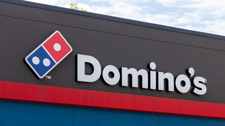
Of course Domino's was going to choose a domino as its logo. It became part of the logo back in 1965, introduced as red-only. It wasn't until 2012 that half the domino became blue. Not only is it a literal representation of the company's name, it's also a clean, linear shape that works wonderfully for designers and printers, especially when reduced to smaller forms for items like napkins and business cards.
But the other and perhaps the most evident significance of the double square is that it resembles an open pizza box. Stretch your imagination a little further, and you can even imagine the dots on each side as pepperonis stuck to the cardboard.
Speaking of the dots ... the greatest significance of these seemingly simplistic design elements is that they represent the original three Domino's locations. The company intended to add more as the numbers expanded, but ultimately stuck with the original three.
Pizza Hut
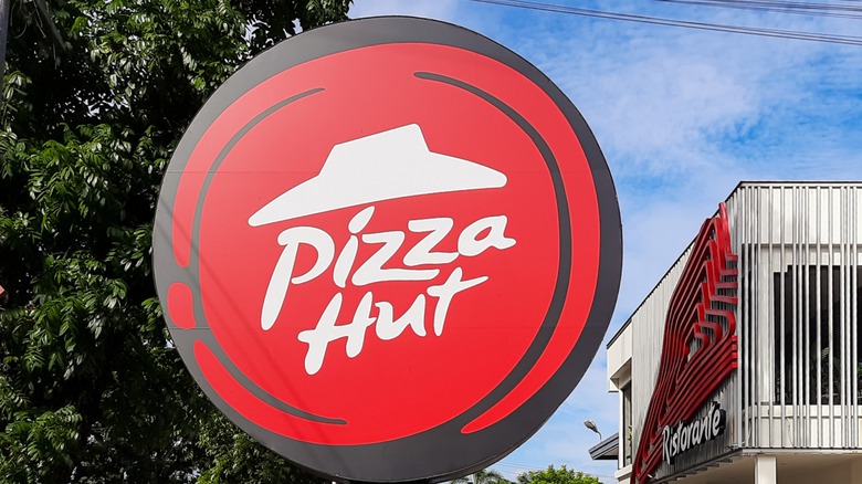
Back when Pizza Hut was one of the hottest sit-down restaurants in America, the company's distinctive red roof became synonymous with a company that provided delicious food in a cozy environment. The chain has featured the hat-like logo topper in every design since 1974. Its hidden meaning is a quaint reminder of Pizza Hut's roots that provides a quick and easy visual vocabulary for corporate branding, even if the blueprint for modern locations no longer includes the red roof.
Pizza Hut worked in a second symbol that brings the pizza aspect of the restaurant into the logo as well. The modern portfolio for the symbol includes a circular icon with a red roof represented in negative space in the center, sometimes with the handwritten Pizza Hut name included as well. It's not difficult to discern the circle with its irregular edge as representing a swirl of sauce on the center of a pizza.
The vibrant color is also an intentional choice; the real reason fast food signs are red is to attract attention from potential customers, something the Pizza Hut logo does incredibly well. It doesn't hurt that red is also an essential color in pizza-making in general.
McDonald's
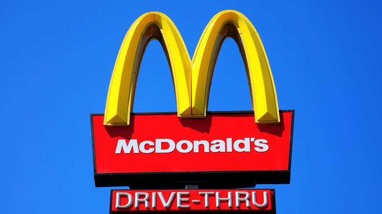
Early McDonald's locations featured neon golden arches that summoned hungry diners from down the road. They became a trademark architectural element that patrons could find all across the U.S. whenever they traveled, reminding them that familiar food wasn't far off.
The shapes mimicking the form of an "M" made the golden arches an easy integration into the logo. It could also be used in the name for even more branding alignment. It was an ideal arrangement that arrived in 1961 thanks to designer Jim Schindler, and an aesthetic achievement that survives to this day (with modifications through the years, of course).
But there's more esoteric — and more sensual — meaning behind the golden arches that might be a revelation to anyone who hasn't dug into the McDonald's lore. According to Louis Cheskin, a design consultant and psychologist from the same era as Schindler, the double-arch shape of the "M" emulates the shape a mother's bosom, a subliminal indication of the nurturing nature of the restaurant's offerings — all of which seems like a stretch.
Little Caesars
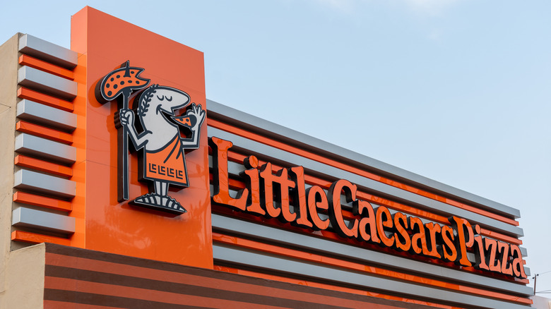
Little Caesars took the obvious path when it chose a cartoon version of the historic human Caesar — Julius or otherwise — to be the restaurant's mascot. Similarly, making Little Caesars' tagline "Pizza! Pizza!" to represent the two-pizza package the chain is famous for is pretty on the nose, as far as branding goes. And having the character spearing a pizza and eating a slice with a smile on his face is as plain a message as you're likely to get.
Where the hidden meaning in the logo comes into focus is in the more recent design details. Originally, Little Caesar wore a toga with basic figures along the hem, standing in for more familiar images like the Greek key design. Over the years, the logo was upgraded and the hem adornments were altered, but they always retained a generic linear quality.
However, when the newest logo was unveiled in 2017, the updated toga design featured a hidden "LC" along the edge, a hat tip to the restaurant's initials. It's a modest change that added major meaning and a fun visual kick that ties a bow on the branding package.
Dairy Queen
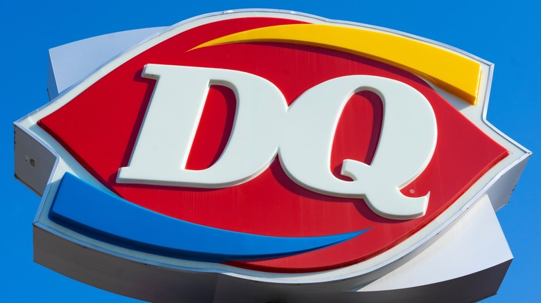
Few people may realize the hidden meaning in the Dairy Queen logo, though it's been in place for decades. The iconic red ellipse that was added in 1960 was chosen to represent lips, a symbol of the mouths that come to DQ to enjoy the food. It's easy to see once you know what you're looking for, even with the other aspects of the logo placed on top of it.
In 2007, the company revitalized the logo by updating the typeface used for the initials and adding two minimal yet significant design elements that worked another layer of meaning into the image. The yellow arc above the letters was chosen to represent the hot items on the menu; similarly, the blue arc underlining the letters hints at the cold treats the chain is famous for.
The placement of the arcs is no coincidence, either. Because heat rises and cold sinks, the physical properties of each are accurately depicted as well.